
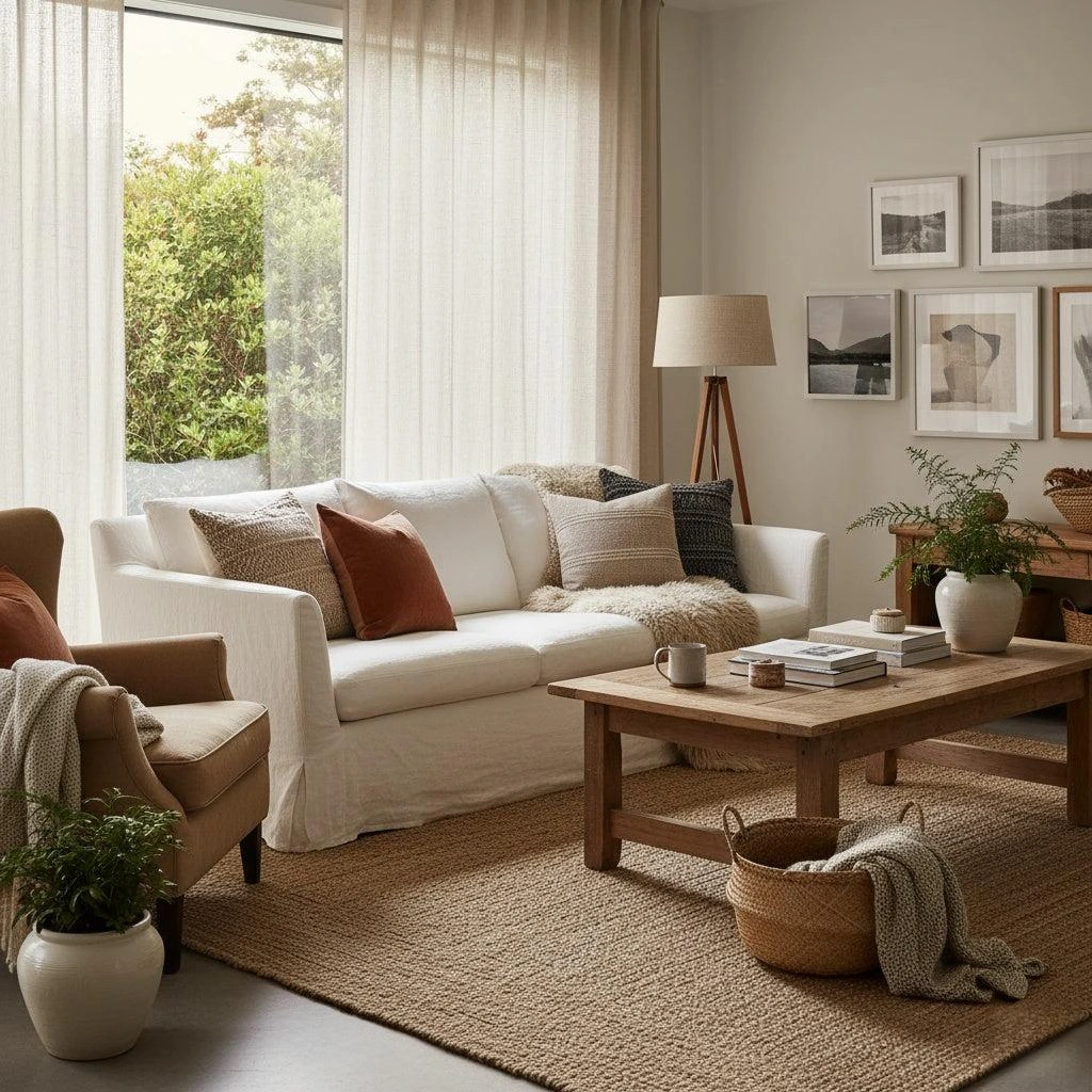

I used to think choosing neutral paint was the easy part. Then I spent a weekend repainting a wall that looked perfect in the tin and wrong on the plaster. This guide is the system I built after that. It has real hex codes, the 60/30/10 rule, a free generator workflow, and the mistakes I keep seeing in otherwise lovely rooms.
A neutral color palette in interior design is a small group of low saturation colors that you repeat across a room in planned amounts. Most working palettes use three to five colors, and each color has a different job. That is the whole idea. The rest of this guide is about doing it in your actual light.
Table of Contents
1. What Is a Neutral Color Palette in Interior Design?
I once painted a wall a soft warm white and came back at four in the afternoon to find it looked slightly pink. Same paint. Same wall. The light had changed on me.
So what is a color palette in interior design, really? It is a small group of colors you repeat across a room in planned amounts. A neutral color palette in interior design uses low saturation colors, usually three to five of them, and gives each one a different job. Those three jobs are the dominant color, the secondary color, and the accent.
The word “neutral” trips people up. They hear it and picture beige walls, a gray sofa, and nothing else. I did that for years. But neutral describes how strong a color is, not which family it belongs to. Deep brown, olive, taupe, and greige can all be neutral because they stay quiet behind other things.
Not every quiet color is boring. Most boring rooms got that way because someone stopped at two colors.
The three jobs every color has
I can tell if a room has a plan from the largest surface. When the walls, the rug, and the sofa share one color family, somebody made a decision before buying paint.
Every interior design color palette splits into three jobs. Designers call it the 60/30/10 rule, and that rule is the backbone of neutral color palette interior design. The numbers are a rough guide to surface area, not a law.
| Role | Share | Surfaces | Example hex | What goes wrong? |
|---|---|---|---|---|
| Dominant | About 60% | Walls, a large rug, the biggest furniture | #EEE4E1 | Too dark here, and the room shrinks. |
| Secondary | About 30% | Curtains, accent chair, cabinetry | #E7D8C9 and #B2967D | Skipped, so the room feels flat. |
| Accent | About 10% | Cushions, art, one dark wood tone | #E6BEAE | Overused, so the room feels busy. |
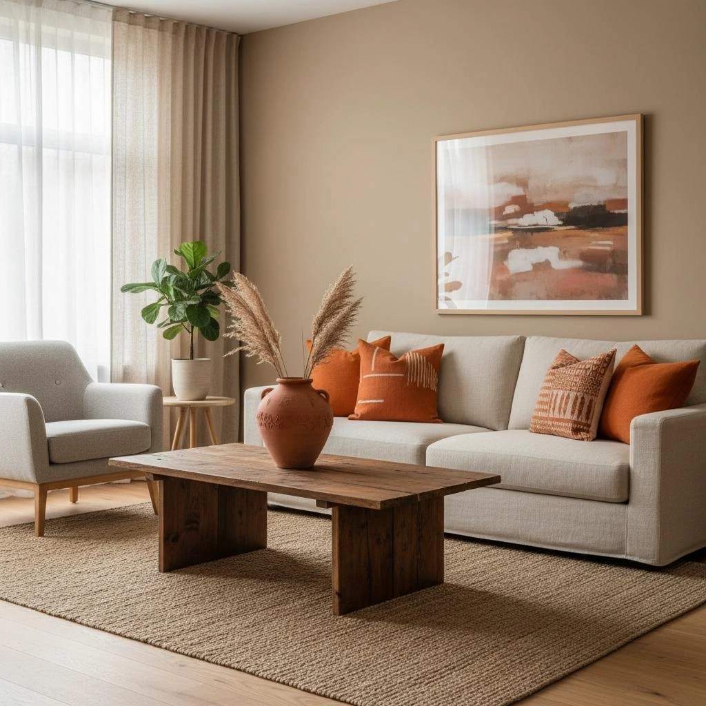
The dominant color sets the temperature of the room. The secondary color gives it depth. The accent gives the eye somewhere to land. A single wall can carry that 10 percent on its own, and I keep a longer list of accent wall ideas for living rooms for when I want to see it done well.
Before I pick any of the three, I look at what stays: the floor, the worktop, the sofa I am not replacing, and the fireplace I cannot move. If the layout is still in flux, I sort the furniture set up for the living room first. A palette built around the wrong sofa position will not survive the first rearrangement. Fixed elements decide a palette far more than any mood board I have ever pinned.
Here is a warm neutral set I keep coming back to. I put #EEE4E1 on the walls, use #E7D8C9 and #B2967D across the sofa and wood, then add #E6BEAE in the textiles. I paint the trim and ceiling in the pale #ECF8F8. Five codes, three jobs, one temperature.
A code like #EEE4E1 stays identical on a paint chart, a fabric sample, and a website. A name like oat does not. That is why I plan in codes and shop in names.
How many colors should a neutral palette have?
Three to five. That is the honest answer, and I wish someone had told me before I bought six different whites for one hallway.
Two colors make a room feel unfinished because the eye has nowhere to rest. Seven colors make a room feel busy even when every shade is quiet. Between three and five, a neutral color palette has enough variety to feel lived in and enough restraint to feel calm. Designers quoted in shelter magazines give the same range, usually three to five colors with one accent that sits outside the scheme. In a small apartment I keep it to three and repeat those three in every room, which is the same idea behind my DIY room decor for small apartments guide.
You can build a whole monochromatic scheme from a single beige. Use a tint for the walls, a mid-tone for the sofa, and a deeper shade for the cushions. Same hue, three different jobs.
When I want more interest, I reach for texture instead of another hue. Linen, wool, and jute finish the job, because each one throws light differently and gives a low-saturation room its depth. That trick costs less than another tin of paint.
Neutral does not mean beige, gray, or white.
Neutral means low saturation and high adaptability. That is the whole test. A color passes if it can sit next to most other colors without arguing.
Greige is the easiest example. Greige mixes gray and beige, so it keeps one foot in the warm family and one in the cool family. In cool morning light, Greige leans warm. Under warm afternoon sun, the same greige can look almost gray. I have watched people repaint because they thought the color had failed when the light had simply changed.
And then there is white. Every white paint carries an undertone, and room light decides which undertone you see. Designers tend to agree that white is one of the hardest neutrals to choose, even though most people treat it as the safest one. Yellow-based whites turn creamy under warm bulbs. Blue-based whites can look clinical in a north-facing room.
Warm and cool neutrals both belong here. The trick is to pick one temperature family and keep walls and trim inside it. Put a warm white wall next to cool white woodwork, and the room will feel slightly wrong, and you may never work out why. Cool neutrals also sit comfortably beside cleaner-lined furniture, so once I have settled the temperature, I check my contemporary interior design guide for the shapes that go with it.
Write down the codes, not the names.
Color names are marketing. Hex codes are instructions.
Most guides skip this part, and it is the part that saved me the most money. A name like oat or soft linen means nothing once you change brands or look at it on a different screen. A six-digit code follows you from a paint chart to a fabric sample to a cushion online. I keep my five codes in a note on my phone. I add a new one only after I have lived with a swatch on the wall for a full week.
I usually move each swatch to three walls and leave it for a week. That one habit has saved me more repaints than any color wheel ever did.
2. Color Wheel Interior Design: Tints, Shades, Tones, and Undertones
I kept a paint fan deck on my desk for a year before I understood why two creams looked nothing alike. The answer was in the tiny numbers printed on the back of the strip.
Color wheel interior design sounds like a classroom subject. For a neutral color palette interior design plan, it is only three dials. Hue is the color family. Saturation is how strong that color is. Value is how light or dark it is. Neutral colors sit at the low end of the saturation dial, and that single fact is what makes a neutral palette work.
Most color schemes in interior design guides stop at the wheel and never tell you what to do with it. The useful part is smaller: pick one scheme from the table below, then decide how much of each color your room can hold.
A tint is a color with white added. A shade is a color with black added. A tone is a color with gray added. Those three words explain almost every neutral I own, because cream is a tint, deep warm brown is a shade, and greige is a tone. Every type of color scheme in this article is built from them.
The main types of color schemes interior design guides use
The color wheel is just a map of hue. Primary colors sit at three points, secondary colors come from mixing them, and tertiary colors fill the gaps. I almost never use the whole wheel in a neutral room. I use it to check that my accent sits far enough away from my base.
| Scheme | What it uses | When I use it | Risk in a neutral room |
|---|---|---|---|
| Monochromatic | Tints, tones, and shades of one hue | Beginners and calm rooms | Looks flat without texture |
| Analogous | Neighbors on the wheel | Sand, clay, and olive rooms | Can drift muddy |
| Complementary | Opposites on the wheel | One accent only | Too loud at full strength |
| Split complementary | A hue plus two neighbors of its opposite | One considered accent | Easy to overdo |
| Triadic | Three hues spread evenly. | Brass against blue-gray, once | Rarely belongs here |
A monochromatic color scheme is the safest route, because three variations of beige cannot clash with each other. An analogous color scheme uses neighbors, which is how sand, clay, and olive end up in the same room. A complementary color scheme uses opposites, and I keep that to an 80/20 ratio so the room stays calm.
Triadic and split complementary schemes use three hues spread around the color wheel. In a neutral room I use them for one decision only, such as a brass lamp against a blue-gray wall. Never as the whole scheme.
Saturation changes the weight of a color. A bright yellow feels loud. Muted mustard feels considered. That is why one neutral room can look cheap and another expensive with the same basic palette.
Combining warm and cool tones in one home
The cleanest method is to choose one temperature family and stay inside it. Mixing warm and cool tones works only when the mix is deliberate. A cool blue gray wall needs warmth from wood, brass, or a tan leather chair, or the room feels like an office.
A warm color palette interior design does not mean yellow paint. It means the undertones lean red and yellow instead of blue and green. Cream instead of stark white. Taupe instead of gray. Clay instead of slate. I keep one warm neutral palette running through the shared spaces, then let a single cool room act as a pause. That way the temperature change reads as a decision. If every room switches temperature at random, the house feels like five different houses.
Texture does the rest. I go back to interior design styles explained when I want to see which shapes suit a warm earthy base and which ones need a cooler one. Old wood and deep browns are also why I keep a note on modern decorating with antiques next to my earthy combos. Earthy umber, olive, and clay show up again in ranch style house interiors, which is a masterclass in warm neutrals.
Building a neutral palette with depth
Depth comes from value, not from more colors. If all five of your colors sit at the same lightness, the room reads flat even when the hues are different.
I check this by squinting at the swatch board. If the five chips blur into one beige, I push one darker and one lighter. A sophisticated neutral palette almost always has one near white, two mid tones, one deeper shade, and one accent that is clearly darker than the rest.
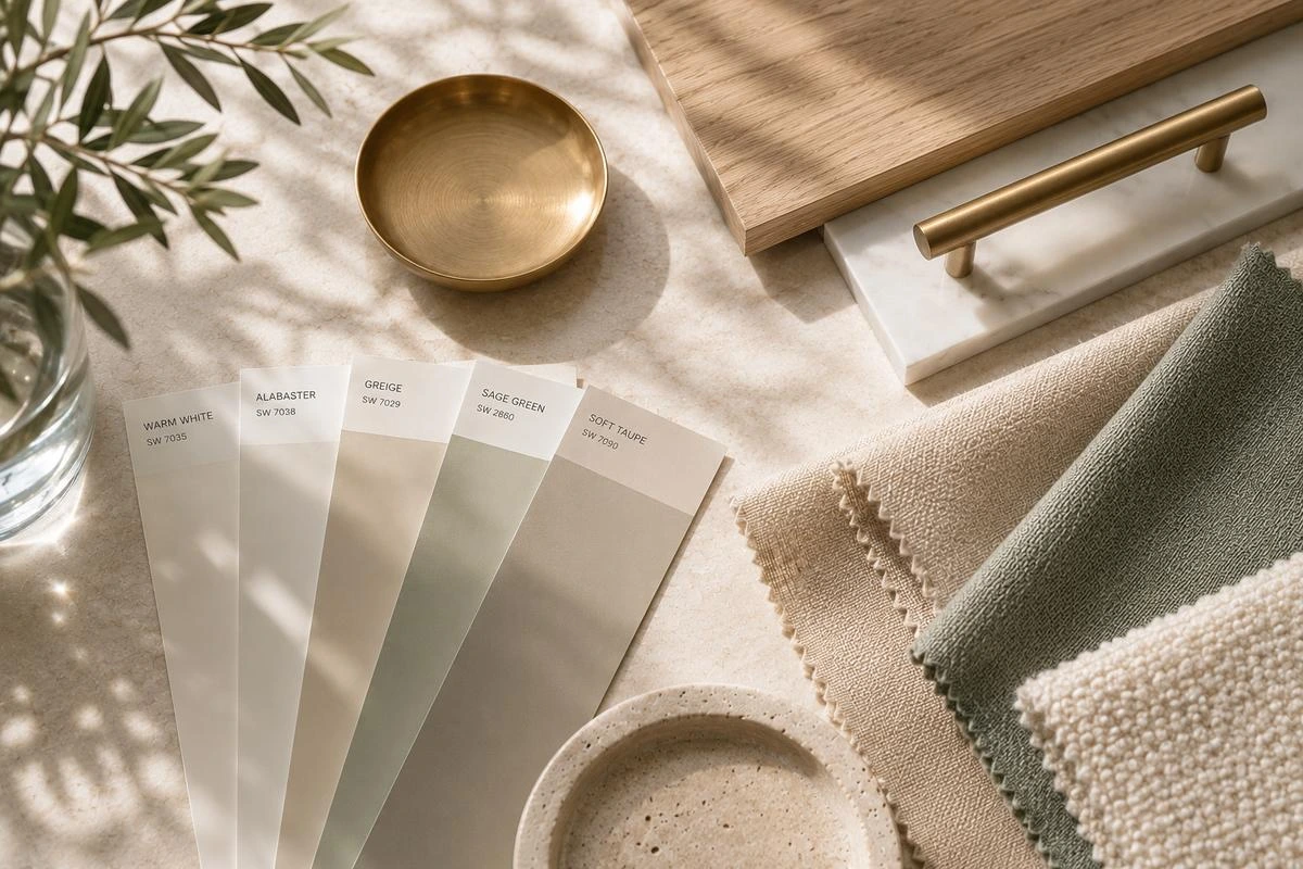
Warm vs cool undertones, white is never just white
Every white and every beige carries a hidden base. It can be pink, yellow, blue, or green. Undertones stay invisible until you put two colors next to each other under real light.
A warm white with a yellow base turns creamy under a warm bulb. A cool white with a blue base can look almost gray in a north facing room. Neither is wrong. They just belong to different light.
This is why I never buy white paint from a screen. I hold the swatch against a plain white sheet of paper first. The white paper gives my eye a fixed reference, and the undertone suddenly shows up.
Color theory is not a set of rules to memorize. It is a way to predict what will happen before you open the tin.
3. How Mood, Light and Room Function Shape a Neutral Palette
The same beige looked calm in my bedroom and gloomy in the hallway. Nothing about the paint changed. The window did.
Room orientation and the job of the room decide whether a neutral palette feels warm or cold. That matters more than any trend list. A north facing room gets cool, flat light for most of the day, so warm neutrals usually feel better there. A south facing room gets warm golden light, so it can carry a cooler neutral or a true white without feeling sterile.
Which neutral for which room direction
Here is the decision table I use. Treat it as a first guess, not a law.
| Direction | Light you get | Best neutral family | Combo to start with | What to test |
|---|---|---|---|---|
| North facing | Cool and flat | Cream, taupe, warm greige | Combo 1 or 2 | Whether the cream turns gray by 4pm |
| South facing | Warm and golden | Cool white, soft gray, or true white | Combo 6 | Whether the white looks harsh at noon |
| East facing | Bright morning, dull later | Most palettes work | Combo 2 or 7 | Evening lamplight, which is the weak spot |
| West facing | Strong afternoon sun | Warm neutrals, muted green, muted blue | Combo 4 | Late afternoon glare on the accent |
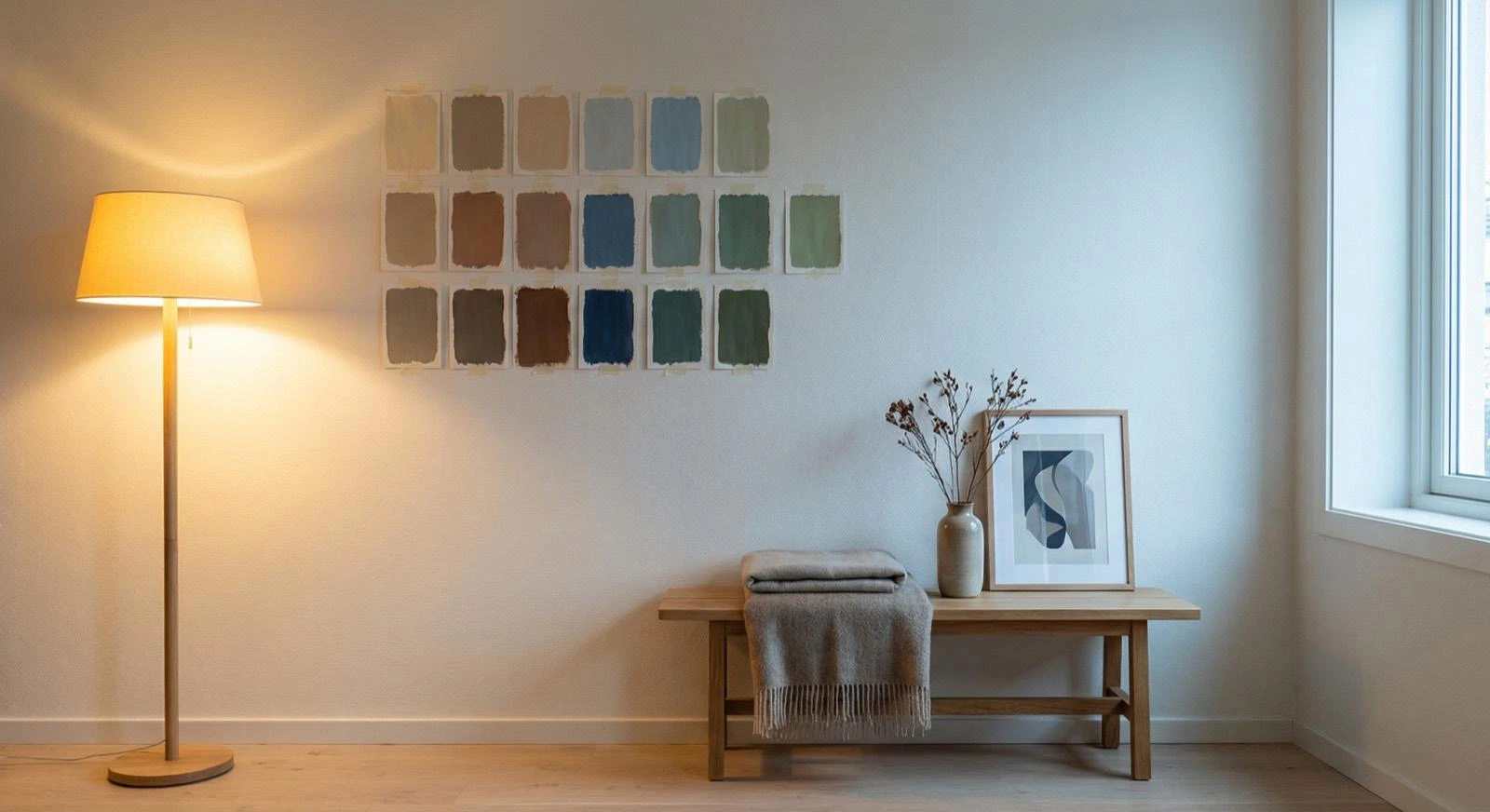
Published advice disagrees here, so I want to be straight about it. Recent shelter magazine guidance and Havenly both favor warmth in north facing rooms. A widely shared tip from The Interior Design Institute leans the other way and suggests cooler undertones for north light. I stopped treating orientation as a law and started treating it as a first guess. The swatch on the wall in your actual light beats any chart on the internet.
That contradiction is useful, by the way. When two respectable sources disagree, the honest answer is that the room decides. Orientation changes how much light you get, not what color you should buy.
Light Reflectance Value, usually shortened to LRV, is the number that tells you how much light a paint bounces back. Higher numbers reflect more light. I check it for dark hallways and small rooms, because a low LRV beige in a windowless space will read as brown mud.
Floors change the calculation too. Bare wood or tile bounces a different color back onto the walls than a thick rug does. My living room without carpet notes exist partly because I kept getting this wrong.
Color psychology without the hype
Color psychology gives you tendencies, not rules. Warm hues suit social rooms and cool hues suit rooms where you need to focus. A small academic study of about 30 participants found that people lean toward quiet colors in rooms built for rest. I treat that as a hint, not proof, because a sample that size cannot speak for how everyone responds.
I also match the palette to the job of the room. A room with a desk and a sofa has two moods, not one, and a single flat beige will not serve both. I wrote about that problem in my computer desk in living room ideas guide.
For bedrooms, the practical version of color psychology is simple. Keep the dominant color quiet and low contrast, then let texture carry the interest. Very saturated walls tend to feel active, which is the opposite of what most people want when they are trying to sleep. If a client wants a stronger color, I put it on one wall behind the bed rather than on all four.
In 2026, saturated greens and jewel tones get the headlines, but the neutral direction moved the other way: toward muddier browns, clays, and sage rather than cool gray. Neutral is a choice now, not a default. A calm room chosen on purpose reads very differently from a calm room that happened by accident.
Light bulbs are the last variable. A warm bulb near 3000K on a dimmer lets one neutral read correctly at noon and at night. The high end living room ideas I admire almost always have layered lighting, not one bright ceiling fixture. Natural and artificial lighting are two different tests, and a good palette passes both.
4. How to Choose a Color Palette for Interior Design (5 Steps)
Most people start with a saved photo. I start with the floor.
Choosing a neutral palette is a five step process, and the order matters. Skip the first two steps and you will be choosing colors that fight the room instead of colors that fit it.
- Write down the fixed elements. Flooring, worktops, tile, the sofa you are keeping, the fireplace you cannot move.
- Decide the mood and the job of the room. Rest, work, hosting, or all three.
- Pick one anchor. A rug, a piece of art, or a fabric you already love.
- Choose a temperature family. Warm or cool. Then stay inside it.
- Pull exact hex codes with a generator and write them down.
Someone once told me to look in my wardrobe for color inspiration. I own a lot of black coats. I would never paint a wall black. Liking a color on your body and living inside that color are two different things.
Audit fixed elements first
I walk into the room and list everything that is not changing. That list is the palette brief. A honey oak floor pushes you warm. Cool gray porcelain pushes you cool. A big sofa eats 30 percent of your visual space before you have chosen a single paint color.
This also answers a question I get a lot: how do I choose a palette that matches my furniture style? Start with the largest piece you own, not the style label. A mid century walnut sideboard, a white slipcovered sofa, and a black metal frame all pull the palette in different directions. Name the undertone of the wood or fabric first, then build the walls around that.
The anchor method designers use works well here. Start with at least three hues, let one fabric or rug be the anchor, and branch outward from it. A single contrasting color outside the scheme is fine.
Once the floor, sofa, and curtains are counted, you may only have two slots left. My things in a living room checklist is the one I use to make sure I have not forgotten a big surface. A sectional is the classic trap. It is so large that it decides the dominant or secondary color on its own, which is why I keep living rooms with sectionals in mind when I plan.
Build a material mood board
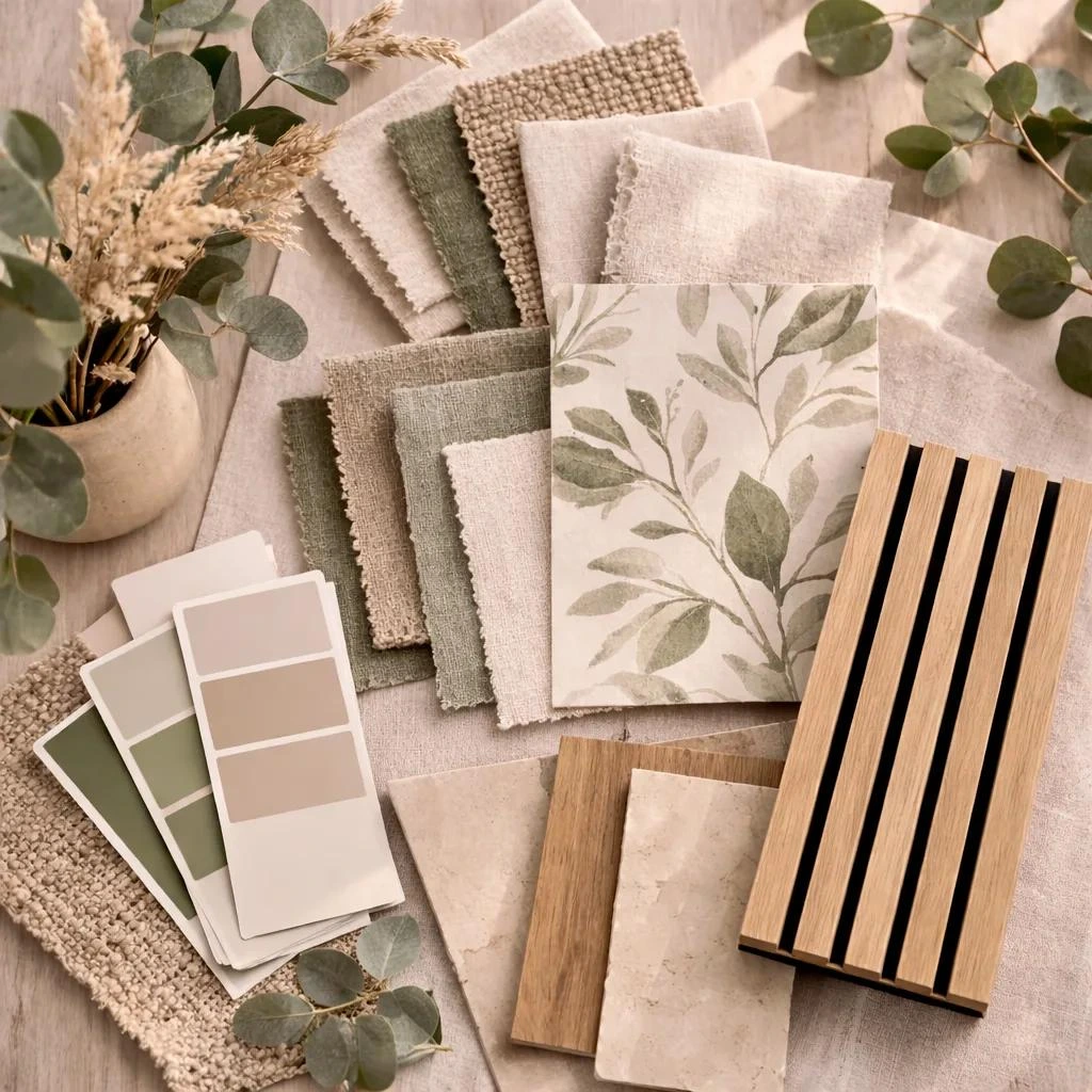
A color palette and a material mood board are not the same thing. The palette is the colors. The board is the colors plus the samples of fabric, wood, tile, and metal that carry them.
I tape paint swatches next to a scrap of sofa fabric and a wood sample. Then I look at them together in daylight and again at night. Colors that seemed fine alone often fall apart next to the real materials.
Pull exact codes with a color generator
I photograph my anchor piece and run it through a free generator. It pulls out hex and RGB values in seconds. I save the five codes I want, then check them against real paint chips, because screen color and pigment never match exactly.
That habit came from small home interior design work, where one palette has to flow through four or five small rooms. When the codes are written down, you can repeat the same warm white in the hallway, the kitchen, and the bedroom without guessing. Section 6 shows the exact workflow.
5. How to Make a Color Palette Interior Design Step by Step
A palette on paper and a palette on a wall are two different things. I learned that after three tins of paint.
Building a neutral color palette interior design plan is simple once the choosing is done. Pick three to five colors, decide the 60/30/10 split, then test them in the room before you commit to any of them. The testing is the step people skip.
Apply 60/30/10
Sixty percent goes to the dominant color on walls and large pieces. Thirty percent goes to the secondary color on upholstery, curtains, or cabinetry. Ten percent goes to the accent in cushions, art, or one dark wood tone.
A neutral room with no accent reads as unfinished. A neutral room with three accents reads as noisy. That 10 percent is not decoration, it is the part that gives the palette a focal point.
The anchor method and the 60/30/10 rule work together. The anchor helps you choose the colors. The ratio tells you where each color goes. I never use one without the other.
Test two coats in morning and evening light
I paint two coats on a large piece of poster board, not straight onto the wall. Then I move that board around the room for a few days. Morning light, afternoon light, lamp light. Different walls, different corners.
Two coats matter. One thin coat lets the old wall color show through and lies to you about the final result.
A proper paint swatch patch test takes a week. I know that sounds slow. It is still faster than repainting a whole room. Yellow and red based colors are the worst for shifting between walls, so I test them on at least two surfaces.
I keep the bulb test in the same week. Natural light and artificial lighting pull undertones in different directions, and a neutral that passes only one of them will disappoint you every evening.
Repeat colors for rhythm and room to room flow
Once the palette works, I repeat it. The accent color shows up in the cushions, then again in a piece of art, then again in a vase across the room. That repetition is called rhythm, and it is what makes a room feel designed rather than assembled.
I spread the colors across the foreground, the middle ground, and the background. Three blue gray cushions in one corner is a clump. One cushion, one rug thread, and one lampshade spread across the room is rhythm.
The same logic applies between rooms. A hallway that shares the warm white from the living room makes the whole home feel connected. My family room vs living room comparison covers why that flow matters more than matching every room exactly.
Start small if you are nervous. One wall or one hallway is enough to test a palette. I have a short DIY room decor for small apartments guide and a set of apartment living room themes for exactly that situation.
6. How I Use a Color Palette Generator for Interior Design
If you want one free trick that changed how I plan rooms, it is this: stop guessing color names and start pulling codes from a photo.
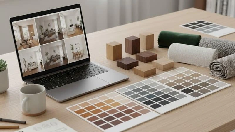
An interior color palette generator takes an image and returns the exact hex and RGB values inside it. You can use that on a rug you own, a tile sample, or a photograph of a room you like. It turns a vague idea like warm and cozy into five codes you can actually buy.
The free workflow I use
I photograph my anchor piece near a window in daylight. I upload that photo to a free generator such as Adobe Color or Coolors. Both are widely used and both export hex and RGB values. I pull five codes, then I delete two, because the generator usually gives me more shades than I need.
Then I write the surviving codes into a note on my phone with the room name next to each one. That note becomes the shopping list. I hand the codes to the paint counter, I search them when I buy cushions online, and I reuse them when I plan the next room.
One warning. Screen color and pigment are not the same thing. A generator gives you a starting point, not a final paint match. I always compare the generated codes with a real paint chip under the room light before buying. Cheap monitors and phone screens shift color a lot, so two coats on poster board still decide the final answer.
What a generator is good for, and what it is not
Generators are good for extracting a palette from something you already own. They are good for finding a tint, a shade, and a tone of one hue. They are good for checking whether your accent really contrasts with your base.
Generators are not good at telling you how a color behaves at 8pm under a lamp. They cannot see your floor. They do not know your window faces north. That is why section 3 and section 5 still matter more than any tool.
7. 7 Neutral Color Palette Combos With Hex Codes
I stopped describing palettes in words after I ordered a cushion called oat and it arrived pink.
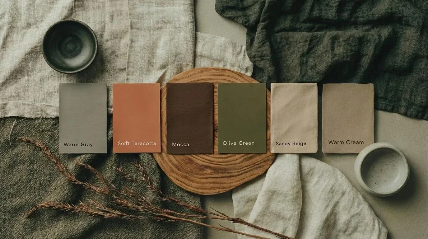
Here are seven interior design color palette ideas with exact hex codes, a 60/30/10 split, and the room I would use each one in. Every palette has exactly five colors, because five is the honest limit. Every code below is from my own palette research, seven palettes with five codes each, and a few codes repeat across palettes on purpose.
| # | Combo | Five hex codes | 60 / 30 / 10 | Best for |
|---|---|---|---|---|
| 1 | Warm Neutral Tones | #ECF8F8 #EEE4E1 #E7D8C9 #E6BEAE #B2967D | 60 #EEE4E1 walls, 30 #E7D8C9 and #B2967D on sofa and wood, 10 #E6BEAE textiles, #ECF8F8 trim | Living room |
| 2 | Soft Stone and Oat | #FAF8F2 #EEE4E1 #D4D0BF #BCACA3 #8F8073 | 60 #FAF8F2, 30 #D4D0BF and #8F8073, 10 #BCACA3 | Bedroom |
| 3 | Greige and Charcoal Contrast | #E0E0E0 #B0B5B3 #706F6F #171612 #D5CAB1 | 60 #E0E0E0, 30 #B0B5B3 and #706F6F, 10 #171612, #D5CAB1 warms the trim | Home office |
| 4 | Earthy Sand and Olive | #F7F3E3 #F1DCA7 #D9AE94 #997B66 #797D62 | 60 #F7F3E3, 30 #D9AE94 and #997B66, 10 #797D62 | Kitchen |
| 5 | Cinnamon Clay Neutral | #FADEC6 #E6BEAE #E7D8C9 #B2967D #774831 | 60 #E7D8C9, 30 #FADEC6 and #B2967D, 10 #774831 | Dining room |
| 6 | Cool Quiet Neutrals | #EBF1FD #A9B9D7 #ACB0BD #5E5C6C #D9DBF1 | 60 #EBF1FD, 30 #A9B9D7 and #ACB0BD, 10 #5E5C6C | South facing room with warm light |
| 7 | Warm White Monochrome | #F7F3E3 #EDE4D9 #D5CAB1 #C9C6B7 #A5A196 | Five tints, tones, and shades of one neutral | Small room or hallway |
Combo 1 is the one I use most. It is a warm neutral tones palette that stays soft without turning gray. Combo 7 is my monochromatic example, and it shows why one hue in five values can still have plenty of depth.
Palette quick picker by color family
People rarely search for “neutral”. They search for the version they already have in their head. Here is how I would start each one. I list the accent as a direction rather than a code, because the right accent usually comes from something you already own.
| If you searched for | Start with combo | Accent direction | Best room |
|---|---|---|---|
| warm neutral color palette interior design | 1 | Deep warm brown or clay | Living room |
| blue color palette interior design | 6 | A deeper navy from your own swatch | Bedroom |
| olive green color palette interior design | 4 | Olive pulled from combo 4 | Kitchen |
| sage green color palette interior design | 4 | Soft sage, grayed down | Bedroom |
| moody color palette interior design | 3 | Charcoal with one deep jewel token | Dining room |
| earth tone color palette interior design | 4 | Terracotta or rust | Family room |
| gray color palette interior design | 3 | Charcoal, kept to 10 percent | Home office |
| modern color palette interior design | 6 | A single warm brass or rust note | Living room |
| scandinavian interior design color palette | 2 | Light oak and off white texture | Living room |
| japandi interior design color palette | 7 | Deep walnut wood tone | Bedroom |
| burgundy color palette interior design | 5 | Burgundy, small areas only | Dining room |
| muted color palette interior design | 7 | Muted ochre or olive | Hallway |
Combos 4 and 5 lean earthy on purpose. In the 1stDibs designer trends survey, deep warm brown roughly doubled in designer preference over a short multi year window, dark gray lost about half its share in a single cycle, and burgundy climbed close to threefold. That is the clearest signal I have that the safe gray era is ending. Those are survey percentages from several hundred designers and the figures need checking against the original report before anyone quotes them, including me.
Use combo 3 or combo 4 when a big piece of furniture has to carry the 30 percent. Cabinetry is the easiest place to do that, and my living room storage cabinet notes show how a mid tone changes the whole wall. Combo 1 also works beautifully around a stone surround, which is why I keep living room fireplace ideas next to it.
Combo 6 is the cool one. It belongs in a bright room with warm light, and it suits a more contemporary look. Combo 7 is a soft neutral minimalism option, and it pairs well with the high end living room ideas that rely on texture instead of color.
If you only want to try one thing, put one of these palettes on a single wall first. My accent wall ideas for living rooms post shows how much a single surface can carry.
8. 2026 Palette Directions and What Colors Are In
What colors are in for interior design in 2026? Warm browns, clays, sage greens, and muted burgundy are leading, while cool gray has lost ground. Warm creams and taupes also remain the safest choice for resale.
The surprise is that the return of color did not kill the neutral room. It made neutral rooms warmer and richer. The directions I keep seeing are deep earth and clay, layered greens, texture led minimalism, and the older white with navy pairing that never really left.
| Direction in my own words | Core colors | My combo | Best room |
|---|---|---|---|
| Deep earth and clay | Warm brown, clay, mushroom beige, natural wood | 5 | Dining room |
| Layered greens | Soft sage into deeper green, brass, tan leather, light oak | 4 with a green accent | Living room |
| Texture led minimalism | Oat, sand, charcoal, linen and wool | 7 | Bedroom |
| White with navy weight | Crisp white, deep navy, warm brass | 6 | Home office |
The National Association of REALTORS has linked warm creams, taupes, and warm grays to resale appeal. That does not mean painting for a hypothetical buyer, but it does make warmth a low risk choice. Color palettes that protect resale value tend to be the boring ones: low contrast, warm, and repeated through the whole home.
For minimalist rooms, the current version is not a white box. It is five close values of one neutral, with the interest coming from linen, wool, and wood grain. That is exactly what combo 7 does.
One caution about trend lists. A survey of designers tells you what professionals are specifying, not what will suit your north facing hallway. Use trends to pick an accent, not to pick your walls. The accent is cheap to change. The walls are not.
9. Room by Room: Living Room, Bedroom, Kitchen and Hallway
The first time I used one palette across a whole house, the hallway finally made sense.
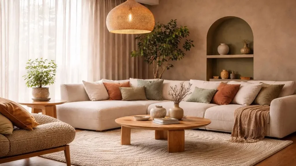
A neutral color palette interior design that works across a whole home follows one rule: one neutral base runs through every room, and only the accent changes. That is the simplest whole home rule I know. It creates the flow people notice but cannot name.
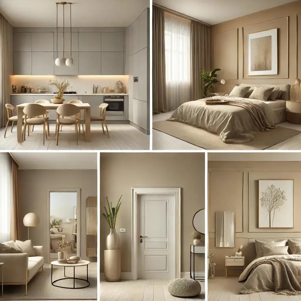
Color scheme for living room
The living room has the most surfaces and the most light, so I put the dominant color here and let it lead. Walls, large rug, main sofa. Then I bring the secondary color in through curtains or an accent chair.
A color scheme for living room works best when the accent repeats at least three times. One cushion, one piece of art, one object on a shelf. That is rhythm and even color distribution in practice.
How do you choose a harmonious palette for a small living space? Use three colors, keep all three light to mid value, and repeat the same three in the room next door. Dark accents shrink a small room, so I put the deepest tone in a cushion rather than on a wall. My apartment living room themes guide has small space examples.
Trim is a real decision here, not an afterthought. White trim gives a crisp traditional outline. Trim painted the same color as the walls gives a softer, more enveloping look. Designers argue about this one, and I have used both. Choose based on whether you want contrast or calm, not based on a rule.
Bedroom and kitchen
Bedrooms want the quietest version of the palette. I drop the accent to almost nothing and lean on texture layering with linen, wool, and jute. A neutral bedroom should feel like an exhale.
This is also where color psychology matters most. Since the room is for rest, I keep the dominant color low contrast and avoid strong warm reds on all four walls. If someone wants a deeper color, one wall behind the bed is enough.
Kitchens have fixed elements that dominate. Cabinets, worktops, tile. I let those be the 30 percent color and keep the walls simple. Combo 4 with its olive accent works well here because it plays nicely with wood and warm metal.
Small homes make this easier, not harder. Repeating one warm white through a small home interior design plan makes four tiny rooms read as one larger space. I also use my things in a living room list in the kitchen, because the same rule about big surfaces applies twice.
Hallway flow between rooms
Hallways get the least light and the most traffic. I keep the warm white from the living room here, and I check the LRV so the corridor does not turn into a tunnel.
How do you choose a cohesive color scheme for an open floor plan? Pick one dominant neutral for every connected wall, then vary only the accent from zone to zone. The eye reads the whole space as one room, so five unrelated accents will look like five unrelated rooms.
Adjacent room flow is the reason I plan the whole home at once. If the hallway is warm and the bedroom is cool, you feel the switch even if you cannot explain it. A living room without carpet also changes the light bouncing into the hallway, so I check that transition on the swatch board too.
10. Where to Get Help: Free Tools, Paint Samples and Color Services
You do not need to hire anyone to build a decent palette. But sometimes you want a second pair of eyes or a faster preview. Here is where I would look, in plain language.
Where can I find free tools to visualize interior paint schemes?
Free browser based palette generators are the easiest starting point. Adobe Color and Coolors both let you build or extract a palette and export hex codes. Larger paint brands also publish their own palette collections and room visualizers, which is useful if you want to see a color in a photographed room before buying. The limits are the same everywhere: a screen is not a wall, so always confirm with a real swatch.
Where can I buy large paint swatches to test at home?
Most paint counters sell sample pots and small chips. For a real test, I prefer a large poster board painted with two coats, because you can move it from wall to wall. Peel and stick samples are also widely sold and are useful when you do not want to paint anything. Which type you choose matters less than the rule: test at a decent size, in daylight and at night, for a few days.
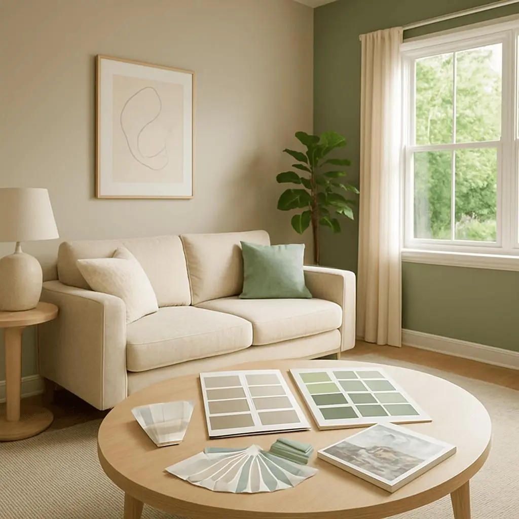
When is a professional color consultation worth it?
A consultation makes sense when you are choosing for a whole house, when you have expensive fixed finishes you cannot change, or when you have already repainted once and still hate the result. Remote and virtual color services have become common, and they usually work from photos you send plus a short questionnaire about light and style. I would not pay for help on a single accent wall. I would consider it for an open plan space with five connected rooms.
Where do I find curated paint collections and color matching?
Most large paint manufacturers publish ready made collections grouped by style or mood. Collections from Sherwin Williams and Benjamin Moore are widely used, and sites like Havenly or Pinterest are useful for seeing those colors inside real rooms. If you need to match an existing fabric or tile, a paint counter with custom color matching is the practical route. Bring the physical item, not a photo of it.
One honest caveat. I am naming categories and widely available tools here, not endorsing a specific product, price, or feature. Check what a tool actually offers before you pay for anything.
11. Neutral Color Palette Mistakes to Avoid
Every mistake in this section is one I have made or watched someone make. None of them is about taste. They are all about process.
A neutral color palette interior design fails when the color is chosen in isolation. The fix is almost always a test, not a better color.
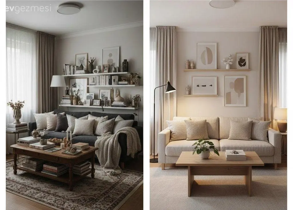
| Mistake | What you see in the room | The fix |
|---|---|---|
| Choosing from a screen or photo | Color looks nothing like the sample | Two coats on poster board, live with it a week |
| Treating all whites as interchangeable | Trim looks dirty or yellow | Compare whites on plain white paper first |
| Mixing warm and cool whites | Room feels vaguely wrong | Keep walls and trim in one undertone family |
| Skipping the accent | Room looks unfinished | Add one deeper tone or one strong texture |
| Adding too many shades | Room feels busy | Cap at five, add pattern instead of paint |
| Testing only in daylight | Color dies at night | Check under your actual bulbs too |
Designers call choosing from a photo without testing the color mistake they see most often. The undertone clash is the one that costs the most money, because you do not notice it until the whole room is painted. And by then the tins are open.
The accent mistake is the easiest to fix. A lamp, a cushion, or a single accent wall idea for a living room can rescue a flat room in an afternoon. My apartment living room themes guide also shows what happens when a small space gets too many colors at once.
I keep the six fixes above as a checklist on my phone. The two I check first are the undertone family and the lamp test, because those two cause most of my repaints.
12. FAQ: Neutral Color Palette Questions
How do I choose a neutral color palette for my living room?
Start with what you are not changing. List the floor, the sofa, the curtains, and any built in furniture. Then check which direction the windows face, pick a warm or cool family, choose three to five colors, and test swatches on the wall before buying. The furniture set up for the living room comes before the palette, not after it.
What is the 60 30 10 rule in interior design?
It is a proportion guide. Sixty percent of a room uses the dominant color, thirty percent uses the secondary color, and ten percent uses the accent. In a neutral room that might look like warm white walls, a taupe sofa, and a dark brown accent.
Can you show the 60 30 10 color palette rule with real codes?
Yes. Use 60 percent #EEE4E1 on walls and the largest pieces, 30 percent #B2967D across wood and upholstery, and 10 percent #774831 in small objects. That is combo 1 with a deeper accent.
What colors go with a neutral color palette?
Deep brown, olive, muted sage, terracotta, brass, and burgundy all work as accents with warm neutrals. Cool neutrals pair better with soft blues, blue grays, and charcoal. Keep the accent to about 10 percent of the room.
Is gray still in style in 2026?
Gray is not gone, but cool gray has lost ground to warmer neutrals in designer preferences over the last couple of years. Warm grays and greige are still easy to live with. If your whole home is gray, you do not need to repaint it. Add warmth through wood, textile, and one warm white on the trim.
What colors are in for interior design in 2026?
Warm browns, clays, sage greens, and muted burgundy are leading, while cool gray has lost ground. Soft neutral minimalism built on oat, sand, and charcoal is also strong. Warm creams and taupes remain the safest choice for resale.
How do I make a neutral room feel warm, not cold?
Use a warm undertone, add texture, and fix the lighting. Cream, taupe, and soft brown do the first job. Linen, wool, jute, and wood do the second. Warm bulbs on a dimmer do the third.
What is a greige color palette?
Greige is a mix of gray and beige. It sits between the warm and cool families, so it can lean either way depending on your light. In cool north light it reads warmer. In warm afternoon sun it reads grayer.
How many colors should a neutral room have?
Three to five. Two feels unfinished, and more than five starts to feel busy even when every shade is soft. If you want more variation, add tints and shades of the same color instead of new hues.
What is color in interior design, in simple terms?
Color is the part of a room your eye reads first, before shape or furniture. In a palette it has three dials: hue, saturation, and value. Neutral palettes keep saturation low and let value and texture do the work.
Do I need to test paint colors before buying?
Yes. Two coats on a large poster board, moved around the room, checked in morning light, afternoon light, and lamp light for a few days. A screen cannot show you how a color behaves in your room.
Can I use a free color palette generator instead of hiring a designer?
For one room, yes. A generator such as Adobe Color or Coolors will pull real hex codes from a photo of something you own. For a whole house with expensive fixed finishes, a professional consultation is worth considering. The generator cannot see your light or your floor.
If you remember one thing, test the paint in your own light before you buy it. Every other decision in this guide is cheap to undo. That one is not.


Pingback: Guest Room Decorating Ideas: 20 That Actually Work - sfdecorstyle.comGuest Room Decorating Ideas: 15 Simple Touches Guests Love
Pingback: What Is Traditional Interior Design? A Clear Guide
Pingback: Best Materials for Industrial House Interiors: 12 Picks
Pingback: Yellow Bedroom Ideas: 15 Easy Looks That Feel Calm and Warm
Pingback: Bedroom Decor With Plants: Simple Ideas for a Calm Space