
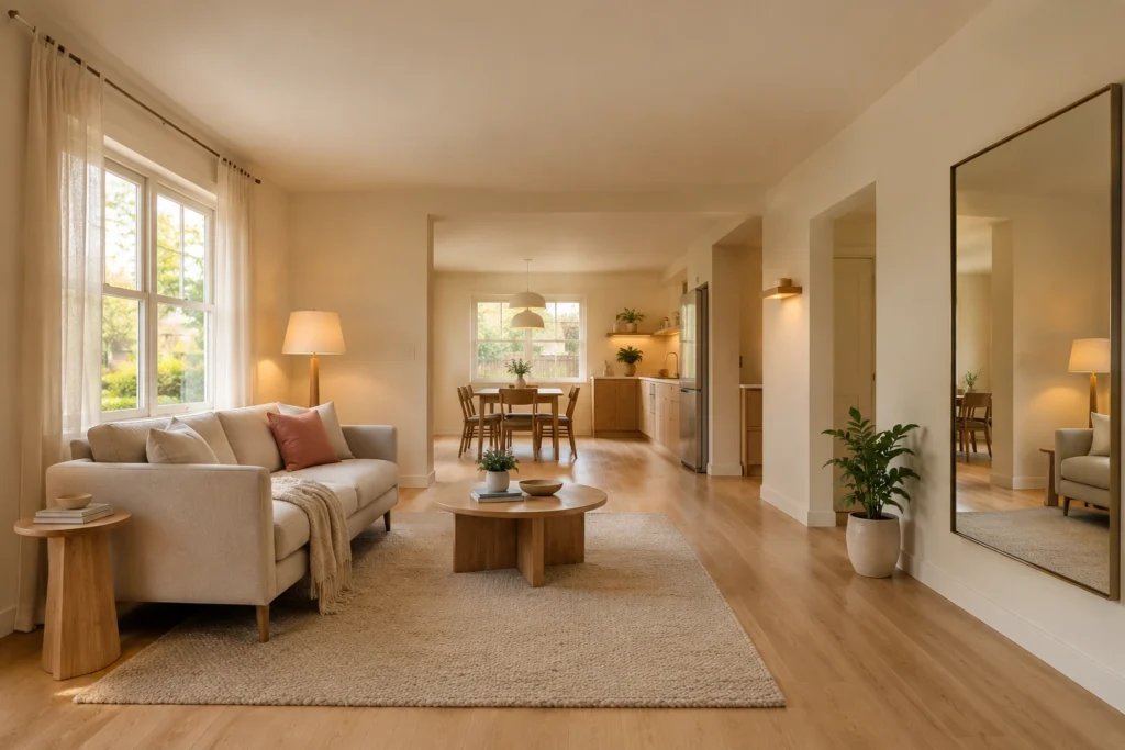

A small home rarely feels tight because of one bad chair. It feels tight when paths narrow, furniture breaks a room into scraps, and every surface carries a job it cannot finish.
Home interior design for small homes means arranging layout, furniture, light, color, and storage so a compact house supports daily life without visual crowding. Square footage sets the hard limit. Layout, scale, light, color, and storage access decide how generous the same floor feels on an ordinary day, and four of those five can be changed without renovation.
This guide gives ten interior design ideas for small homes in a fixed order, room by room where it matters, because order is where most compact-home projects fail. A beautiful fitted cabinet bought in month one will lock a weak layout in place for a decade.
- Map the day before you draw the room
- Protect movement: keep the gaps, not just the walls
- Fix scale right-size, don’t shrink
- Make furniture flexible; every piece clocks in twice
- Settle color continuity beats brightness
- Open the light windows first, mirrors second
- Place storage by use, not by availability
- Give the living room one layout for three jobs
- Build systems for bedroom, entry, kitchen, and bath
- Spend in stages: rearrange, add, build last
Start with rearrangement. Add portable pieces second. Save built work for last, after the layout has proven itself in real routines.
The 10 Ideas at a Glance
| # | Idea | Room it changes most. | Effort | Cost band | Impact |
|---|---|---|---|---|---|
| 1 | Map a weekday before you plan a room. | Whole home | Low | Free | ★★★★★ |
| 2 | Measure door swings, paths, and drawer clearance, not just walls | Whole home | Low | Free | ★★★★★ |
| 3 | Keep ~60–65% of the shared floor visually open (planning check, not law) | Living, open plan | Low | Free | ★★★★☆ |
| 4 | Choose one honest-sized anchor seat instead of many small ones. | Living room | Medium | Medium | ★★★★☆ |
| 5 | Buy only pieces that do two jobs well. | Living, bedroom, dining | Medium | Medium | ★★★★★ |
| 6 | Keep wall, trim, and ceiling related; use 60-30-10 as a loose ratio. | Whole home | Medium | Low | ★★★★★ |
| 7 | Hang curtain rods 15–20 cm (6–8 in) above the frame, wider than the glass. | Any window room | Low | Low | ★★★★☆ |
| 8 | Use three light layers at 2700K–3000K, not one ceiling fixture. | Whole home | Medium | Low–Medium | ★★★★☆ |
| 9 | Store by frequency: daily in reach, weekly behind doors, seasonal high or deep | Kitchen, bedroom, entry | Medium | Low–Medium | ★★★★☆ |
| 10 | Rearrange first, add second, build last. | Whole home | — | Staged | ★★★★ |
Table of Contents
- The 10 Ideas at a Glance
- Home Interior Design for Small Homes Starts With an Ordinary Tuesday
- Leave Room to Move, Then Give Each Zone a Job
- Don’t Shrink Every Piece—Get the Scale Right
- Let Beds, Desks, and Tables Disappear When the Day Changes
- White Is Bright, but It Isn’t the Whole Color Answer
- Treat Windows Like Extra Square Footage
- Interior Design Ideas for Small Homes: Storage That Stays Out of the Way
- Interior Design for a Small Living Room: One Layout for Hosting, Working, and Unwinding
- Small Bedroom Design: The Bed Decides Everything Else
- The Entry, Kitchen, and Bath Need Systems, Not More Baskets
- That Awkward Corner Might Be the Most Useful Spot You Own
- Modern Interior Design for Small Homes Can Feel Warm, Not Bare
- Home Design for Small Spaces: Do These Fixes in Order
- What It Costs, and Where to Spend It
- FAQs
- What colors make a small room look bigger?
- Should I buy smaller furniture for a small room?
- How much floor should stay open in a small living room?
- Do mirrors really make a small room look bigger?
- How can I add storage without making my small home feel cramped?
- Can I work from home in a small living room without a permanent desk?
- Are built-ins worth it, or should I use freestanding storage?
- What is the cheapest way to make a small house feel bigger?
Home Interior Design for Small Homes Starts With an Ordinary Tuesday
Plan the weekday before you plan the room. Most small-home layouts fail not because the furniture is wrong but because it was chosen for a showroom, not for a Tuesday.
I do not start with paint samples. I start with Tuesday: where shoes land, where coffee waits, where a laptop opens, where laundry pauses, and where two people try to pass each other without turning sideways. A room plan built around those moments stops storage and furniture from fighting the people who live there.
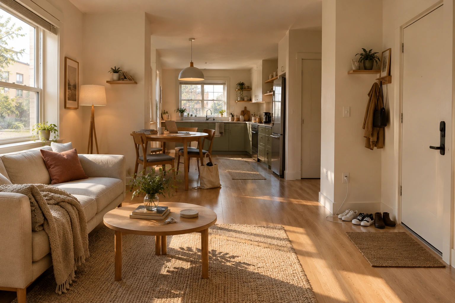
When Decorating Small Spaces, Map the Day Before the Room
Give every room a named job before anything gets bought. Decorating small spaces works faster when the jobs are written down first, because a room with no named job collects objects by default.
I list six tasks morning, work, cooking, rest, guest, and cleaning and mark what each one needs within reach. If you are starting from zero, a full inventory of what the room already holds makes the second list faster. Then I place storage against that list:
| Item frequency | Where it belongs | Example placements |
|---|---|---|
| Daily (used 5–7×/week) | Arm’s reach from the action | Cups beside the kettle, chargers at the desk, cloths under the sink |
| Weekly | Behind a door or one shelf up | Serving bowls, ironing board, backup toiletries |
| Seasonal | High, deep, or inside furniture | Under-bed boxes, on top of a tall cabinet, inside a storage bench or ottoman |
| Rare / archive | Off-site or the least-used room | Old files, out-of-season appliances, spare furniture |
I also edit before I store. A new container only hides an object that no longer serves a routine; buying bins for things you should have removed is the most common wasted spend in a small house.
Measure the Gaps You Need to Keep, Not Just the Walls
Walls tell only half of a floor plan; the gaps tell the other half. Room dimensions tell you what fits on paper. Clearances tell you what works while someone is carrying a pot of rice.
Measure these before a single purchase, and write them down:
| Measurement | Why it matters | Working minimum (guideline) |
|---|---|---|
| Door swing arc | A hinged door steals a triangle of floor every time it opens. | Note the full arc; see the door section below. |
| Main walkway width | Two people passing without turning sideways | 90 cm (36 in); 75 cm (30 in) absolute minimum |
| Drawer and cabinet pull-out depth | A drawer that cannot fully open is dead storage. | Measure the obstruction in front, not the drawer itself |
| Chair pull-back at a dining table | Seats that cannot be pushed back get used once. | 75–90 cm (30–36 in) behind each seat |
| Bed-side clearance | Making a bed and getting out of it are different problems. | 60 cm (24 in) on at least one side |
| Ceiling height at the low point | Decides on loft, platform, and tall-cabinet feasibility. | Measure the lowest beam, not the highest ceiling. |
| Appliance delivery path | The fridge that cannot turn the corner is a returned fridge. | Measure doorways, stair turns, and lift depth. |
These are planning guidelines, not building-code figures. Confirm load-bearing walls, egress, and any required clearance with a qualified local professional before structural work.
A functional home layout protects those gaps. Once the tape shows the real limits, furniture choices stop being arguments about taste and become arithmetic.

Leave Room to Move, Then Give Each Zone a Job
An open floor is not a leftover floor. In an open plan, empty paths and visual pauses let one area turn into the next without a daily obstacle course.
I keep roughly 60 to 65 percent of a shared living floor visually open as a planning check. That figure is my own working heuristic, not an industry standard; treat it as a smoke detector. If the open share drops well below it, I adjust for narrow rooms, door positions, and the number of people actually using the space before I buy anything decorative.
That share is a warning light, not a law. If furniture covers most of the room, fix the arrangement before the decor. Decor on top of a blocked plan just makes the blockage prettier.
Use rugs, light, and low dividers to draw the lines.
Zones need edges, not walls. Rugs, lighting, and low dividers can mark where one job ends and another begins while sight lines stay open, which is what keeps a small house interior design plan from feeling chopped.
| Zoning tool | How it draws the line | Use it when | Avoid it when |
|---|---|---|---|
| Rug | Front legs of main seating on it, defining one zone | Open-plan living/dining share a floor | Rug is smaller than the seating group — it reads as a postage stamp |
| Low bookcase / open shelf | Solid enough to signal a boundary, open enough to pass light | You want separation without losing daylight | Depth exceeds 30 cm in a narrow room |
| Slim console behind a floated sofa | Gives the sofa a “back” and a surface | The sofa faces into the room | The gap behind it becomes a dumping zone |
| Light pools | A pendant over the table, a lamp over the reading chair | Ceiling height allows a hanging fixture | One fixture is trying to light every zone at once |
| Paint tone shift | One step deeper on the dining wall, same family | You own the walls | The shift crosses a doorway it fragments rather than zones |
| Curtain / folding screen | Soft, removable, renter-safe | Privacy is needed occasionally, not always | It blocks the only window |
A studio apartment layout needs the same visual edges, minus the full walls.
Keep a Clear Path Through the Middle of Real Life
Test the loop with your hands full. A space-maximizing layout passes one simple test: daily movement feels boringly easy.
I walk the loop entry to kitchen, sofa to bathroom, desk to storage carrying something. Awkward turns show up immediately when your hands are occupied, and stay invisible when they are not.
Two questions settle most layouts:
- Does any chair block a drawer, a door, or a cabinet pull-out?
- Does any table force a sideways squeeze between it and the wall?
Fix those before paint. If the answer to either is yes, no color choice or accessory will compensate, because the irritation repeats dozens of times a day and the fix is usually one of eight living-room layout patterns, not a new purchase.
Don’t Shrink Every Piece — Get the Scale Right
Tiny furniture can make a small room look nervous. A crowd of little tables, skinny chairs, and small storage boxes breaks sight lines into busy fragments, and the room reads as cluttered rather than compact.
I would rather use fewer pieces with honest proportions and enough surface to be genuinely useful. Furniture scale and proportion matter far more than an “apartment size” label on a tag.
A sofa can be full length in a small living room if three things hold:
- the arms stay slim (bulky arms add 15–25 cm of dead width each)
- the back stays low, so the window behind it stays visible
- the legs show floor beneath the frame, so the surface reads as continuous
One Honest-Sized Sofa Beats a Crowd of Little Chairs
Choose the anchor first and measure its depth as carefully as its width. One good anchor gives a room a center; four small pieces give it four competing centers.
I pick the main seat first, then remove every occasional piece that duplicates its job. Depth is the number people get wrong a 95 cm-deep sofa in a 3 m room eats a third of the floor, while an 85 cm-deep sofa with the same seat count leaves the room walkable. If the anchor you are considering is a sectional, see how a sectional behaves in a small living room before you rule it out.
Visual weight shapes the result as much as actual size. A pale, leggy sofa can share a footprint with a dark, blocky loveseat and still leave the floor readable, because the eye passes under it and the light color recedes.
| Anchor piece | Works in a small room when | Reads heavy when |
|---|---|---|
| Full-length sofa | Slim arms, low back, visible legs, pale or mid-tone upholstery | Rolled arms, skirted base, dark chunky weave |
| Two-seat + one accent chair | The chair is genuinely different in height or material | Both pieces are the same dark, same height, same fabric |
| Built-in bench | It has storage under it and cushions on it | It is bare plywood with no back support |
| Daybed | It reads as seating by day, sleep by night | It is a permanent mattress in the middle of the living room |
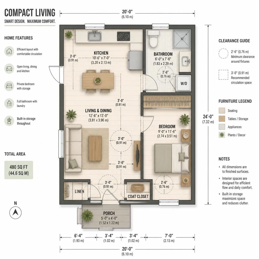
Legs, Low Backs, and See-Through Pieces Feel Lighter
Floor you can see is floor you feel you have. Furniture with legs lets light pass underneath. Low backs keep windows visible. Glass, open shelving, and slim metal frames help in tight spots.
Use transparency sparingly, though. An all-glass, all-metal room turns cold and echoey; one or two see-through pieces against warm wood and fabric is the useful ratio.
I protect one focal point per room. Art, a media wall, bold chairs, and patterned curtains all shouting at once make even a carefully measured room feel restless. Pick the one thing the eye should land on and let everything else recede.
Let Beds, Desks, and Tables Disappear When the Day Changes
A piece earns its floor only when it can handle more than one part of the day. Single-job furniture can swallow an unreasonable share of a compact floor, so before buying I ask what a piece does in the morning, at dinner, and after guests leave.
Flexible does not mean flimsy. A wobbly folding table stays folded forever, and a hard-to-open sofa bed becomes a laundry pile with cushions. Test the mechanism in the shop, repeatedly, with one hand.
Pick the Pieces That Can Clock In Twice
Multifunctional furniture works only when both jobs feel natural. A storage ottoman that seats a guest is worth it. A coffee table that requires three steps to convert is not.
| Piece | Does the job of | Buy it when | Watch out for |
|---|---|---|---|
| Storage ottoman | Seat + footrest + blanket box | The living room has no linen closet | No gas strut on the lid; a lid that slams |
| Sofa bed | Sofa + occasional guest bed | Guests stay a few nights a year | Mattress under 10 cm; a bar you can feel through it |
| Murphy / wall bed | Bedroom + full floor space by day | One room must be office and bedroom | Wall must take the load; needs clearance when down; bedding needs its own home |
| Extendable dining table | 2–4 seat daily + 6–8 seat hosting | Guests come monthly, not weekly | The leaves have nowhere to live, so they get lost |
| Drop-leaf / fold-down table | Tiny daily surface + full dining | The dining zone overlaps circulation | Hinges that wobble after a year |
| Lift-top coffee table | Coffee table + desk + hidden storage | You work from the sofa | The top must lock raised, or it drops on a laptop |
| Daybed | Seating by day + sleep by night | A guest room does not exist | Reads as a permanent mattress in the main room |
| Nesting tables | One surface + two spares | Guests arrive unpredictably | Cheap sets scratch each other |
| Storage bed (drawer base) | Bed + wardrobe overflow | No room for a second closet | Drawers need ~60 cm of side clearance to open |
Space-saving furniture should save effort too, not just centimeters. Casters let a cabinet move for cleaning or guests. A sofa bed suits occasional sleep; a Murphy bed suits frequent sleep but only after you check the hardware, the wall fixing, and where the bedding lives when the bed is up.
A Desk That Folds Away Gives the Evening Back
A wall-mounted desk can hold a laptop without claiming the room all night. Place it near an outlet and daylight, keep the chair path clear, and make sure the closed depth is shallow enough that nobody clips it walking past. Measure both states before you buy closed depth against the wall, and the floor it needs once a chair is pulled out. Fold-down desk layouts cover the numbers for each option.
Cable clutter is what ruins the trick. I keep the charger, notebook, and mouse in one box beside the desk, then close the surface after work. If the reset takes more than ninety seconds, it will not happen, and within a week the “fold-away” desk is a permanent shelf.
The living room gets its evening job back which is the actual point.

White Is Bright, but It Isn’t the Whole Color Answer
Color changes perceived size through continuity, not through brightness alone. White paint gives brightness. Brightness by itself does not give breathing room.
In some small homes, bright white walls define every corner so sharply that the room boundary becomes impossible to ignore. What expands a compact room is a scheme where wall, ceiling, trim, floor, and large furniture stay related pale or deep. Chopped contrast between those five surfaces is what makes a small room look smaller.
This resolves a contradiction you will find across design sites: some insist you avoid a strong feature wall in a small room, others insist you add one. Both are half right. The deciding factor is not the darkness of the color it is whether the adjacent surfaces stay connected.
Choose a Base, a Supporting Color, and One Confident Accent
Use the 60-30-10 rule as a loose starting ratio, not a grading system.
| Share | Covers | In a small home, use |
|---|---|---|
| 60% | Walls, ceiling, floor, largest furniture | Light neutral warm off-white, pale clay, soft stone |
| 30% | Upholstery, curtains, rug, wood tones | One step deeper than the base, or a quiet wood |
| 10% | Cushions, art, one chair, hardware, a single painted piece | The only saturated color in the room, repeated in 2–3 places |
A light color palette need not mean stark white. Warm off-white, pale clay, soft stone, and quiet wood reflect light without the empty rental-listing feel. Texture gives a neutral color scheme more life than five competing accents ever will.
Matching trim to the wall instead of contrasting white trim is the single cheapest trick here. It removes the visual “box” edges that make a short wall read as even shorter.
Which Color for Which Light: Match the Paint to the Window
The right shade depends less on trend and more on which direction your window faces and how far daylight actually reaches the back wall.
| Room condition | Go for | Avoid | Why |
|---|---|---|---|
| North-facing / no direct sun | Warm white, cream, pale clay, warm greige | Cool grey, blue-grey, clinical white | Cool tones read flat and slightly green in indirect light |
| South-facing / strong sun all day | Cool white, pale grey-green, soft blue-grey | Warm cream, terracotta, yellow-based beige | Direct sun amplifies warmth; cream can turn orange by mid-afternoon |
| East-facing / bright morning only | Neutral white, pale sage, soft blush | Deep saturated color on the morning wall | Morning light is warm and flattering; afternoon goes cool |
| West-facing / hot evening light | Soft grey, muted green, off-white | Warm yellow, peach, terracotta | Evening sun is intense and over-warms any warm pigment |
| Deep room, one window | Same color on walls, trim, and ceiling | Contrasting trim, picture rail, dark ceiling | Matching all five surfaces removes the box edges |
| Low ceiling (under 2.6 m) | Ceiling lighter than walls; tall curtains, vertical lines | Dark ceiling, horizontal banding, chunky cornice | Draws the eye upward |
| Interior room, no window | Mid-tone plus a mirror opposite the door; layered light at 2700K | Pure white with one fixture | White with no light source reads grey and grim, not bright |
| Rented / cannot repaint often | Neutral base; color through cushions, art, one rug | Full-wall saturated color | Cheaper to swap textiles than to repaint |
When a Deep Color Quiets the Edges Instead of Closing In
Deep green, ink blue, plum, or charcoal can work in a small house when connected surfaces stay related. Matching or near-matching trim reduces the chopped effect on short walls, and a deep cohesive scheme can feel calm and expensive rather than cramped.
Always test a large sample in both daylight and evening light. A north-facing room can turn a rich color muddy by 4 p.m., and a small painted patch on one wall will not tell you that.
Should every small home go dark? No. Low-light rooms often suit a warmer pale base. The real enemy is not darkness. Fragmentation is. Once you have settled on a deep tone, which accent-wall treatment suits the wall you picked decides whether it reads as calm or as heavy.
Treat Windows Like Extra Square Footage
Check windows before mirrors. A blocked window shrinks a room twice: daylight drops, and the eye loses the longest view in the space.
Heavy furniture pushed against glass and thick curtains pulled across the frame do quiet damage all day, every day. Neither is a decision anyone makes deliberately they accumulate.
Natural light changes more than mood. Window size, wall shape, and furniture arrangement change how dense a room feels at the same floor area, which is why clearing one window can do more than repainting three walls.
Hang Curtains for Height, Then Layer Light Where You Use It
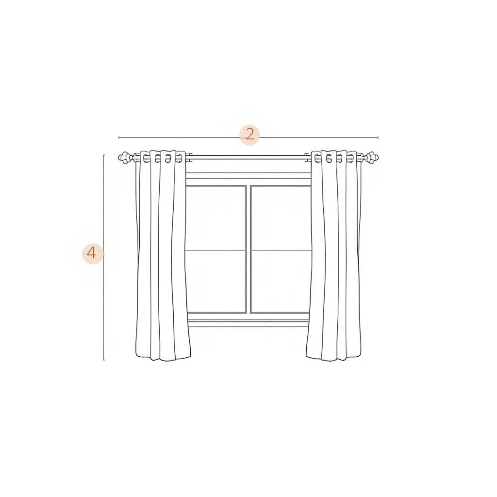
Hang the curtain rod 15–20 cm (6–8 inches) above the window frame, and extend it beyond both sides. Open panels should sit on the wall, not across the glass.
This is a widely used interior guideline rather than a measured standard, but the effect is consistent: raising the rod pulls the eye up toward the ceiling, and widening it lets the full window show when the curtains are open.
In a room with a low ceiling it is the cheapest height you will ever buy.
| Window treatment | Light control | Visual bulk | Best for |
|---|---|---|---|
| Sheer panels, rod hung high and wide | Soft diffusion, no privacy at night | Lowest | The default choice in a small room |
| Roller / solar blind | Precise, disappears when up | Very low | Bedrooms, west-facing glare, renters |
| Shutter | Excellent, permanent | Medium | Owner-occupied, and only if the reveal is deep enough |
| Blackout curtain | Total | High | Shift sleepers; pair with a sheer behind it |
| Heavy draped curtain at frame height | Good | Highest | Avoid — it caps the ceiling and covers glass |
Layered lighting finishes the job after sunset. One ceiling fixture leaves the edges dull, and dull edges pull the room inward.
| Layer | Fixture | Where it goes in a small home | Color temperature |
|---|---|---|---|
| Ambient | Flush mount, recessed downlights, simple pendant | Center, or evenly spaced in a long narrow room | 2700K–3000K |
| Task | Adjustable desk lamp, under-cabinet LED strip, reading sconce | Kitchen counter, desk, bedside, dressing mirror | 3000K–4000K |
| Accent | Wall-washer, picture light, LED strip behind a shelf | Artwork, a textured wall, shelving, one dark corner | 2200K–2700K |
| Control | Dimmer, or separate switches per layer | Every room with more than one fixture | — |
Warm 2700K is the cozy end of the spectrum and the safest default for living rooms and bedrooms; cooler 3000K–4000K suits kitchen and desk task light. A dimmer on the ambient layer is the cheapest way to make one room work as a workspace at noon and a retreat at nine.
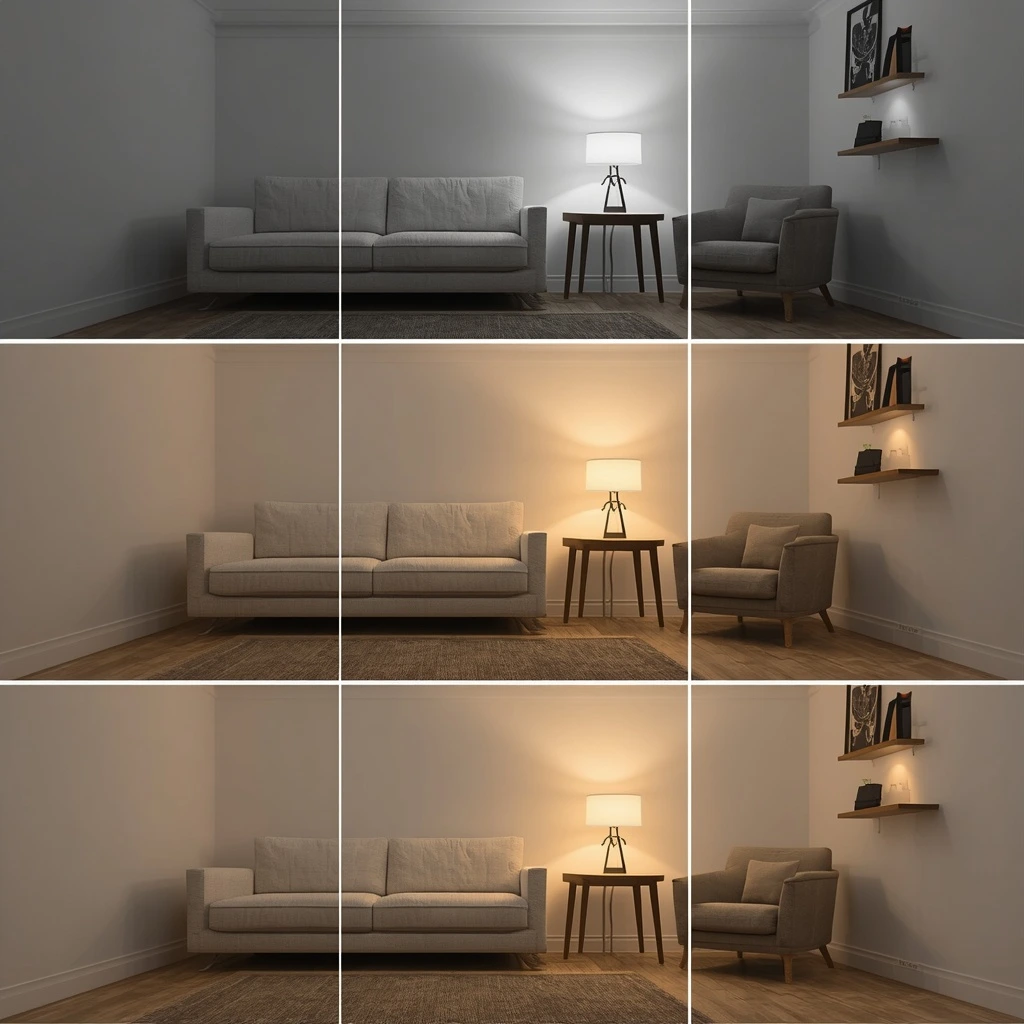
Put the Mirror Where It Has Something Good to Reflect
A mirror enlarges a small room only when it reflects daylight, a window view, or a calm focal point. Placement matters more than size. Facing clutter, a mirror simply gives the clutter a second showing.
For hanging height, the common gallery standard is to center the artwork or mirror at roughly 145–150 cm (57–59 inches) from the floor, which puts it near average eye level. Above a piece of furniture, a mirror width around two-thirds of the piece below usually looks balanced. Both are conventions rather than rules I check the reflection from the doorway before drilling anything.

| Mirror placement | Effect | Caution |
|---|---|---|
| Opposite the main window | Throws daylight back into the room | Confirm what it reflects at night a lit kitchen, or a wall |
| On a wardrobe or closet door | Doubles perceived width, costs no wall space | Full-length reflection can feel exposing in a bedroom |
| At the end of a narrow hall | Lengthens the corridor | Must reflect something worth seeing, not a shoe rack |
| Behind a lamp or sconce | Adds depth after dark | Heat and glare against the glass |
| Leaning full-length on the floor | Casual, renter-safe, adds height | Takes floor footprint and can be unsafe around children |
Interior Design Ideas for Small Homes: Storage That Stays Out of the Way
More baskets do not fix a storage problem when daily objects land far from their jobs. Good storage starts with editing, then gives every category a place in a hierarchy based on how often you touch it.
| Tier | Access needed | Placement principle | Typical spots |
|---|---|---|---|
| Daily | Instant, one-handed | Within arm’s reach of the task | Open shelf at waist height, drawer nearest the point of use, hooks at the door |
| Weekly | Two steps is fine | Behind a door, one shelf up, or in a shallow cabinet | Over-door rack, second shelf, closed console |
| Seasonal | Rare, may need a step | High, deep, or inside furniture | Top of a tall unit, under-bed box, storage bench |
| Archive | Almost never | Least-used room, or off-site | Loft, store room, self-storage |
Accessible storage keeps a home calm because people can put things back without a small excavation. Hidden storage fails when the hidden item is needed three times a day which is exactly how a beautiful closed cabinet ends up with everything piled on top of it.
Daily Things Within Reach, Seasonal Things Out of Sight
Put each object next to the action that uses it. Cups near drinks. Cloths near the sink. Chargers near the desk. Spare bedding near the bed. Most clutter piles form precisely where that logic breaks.
Vertical storage and floating shelves pull objects off the floor, which matters because visible floor is what makes a small house feel larger. Under-bed storage suits linens and off-season clothing. Modular storage units can move, stack, or split as needs change the right answer for a rented home or a household that is about to change size.
| Modular system | Solves | Worth paying extra for | Skip |
|---|---|---|---|
| Full-height wardrobe | Dead space above 180 cm | Internal drawer bank, pull-down rail | Glass fronts — clutter shows through |
| Stackable cube system | Flexible, renter-friendly storage | Fabric bins that match the palette | Open cubes at eye level |
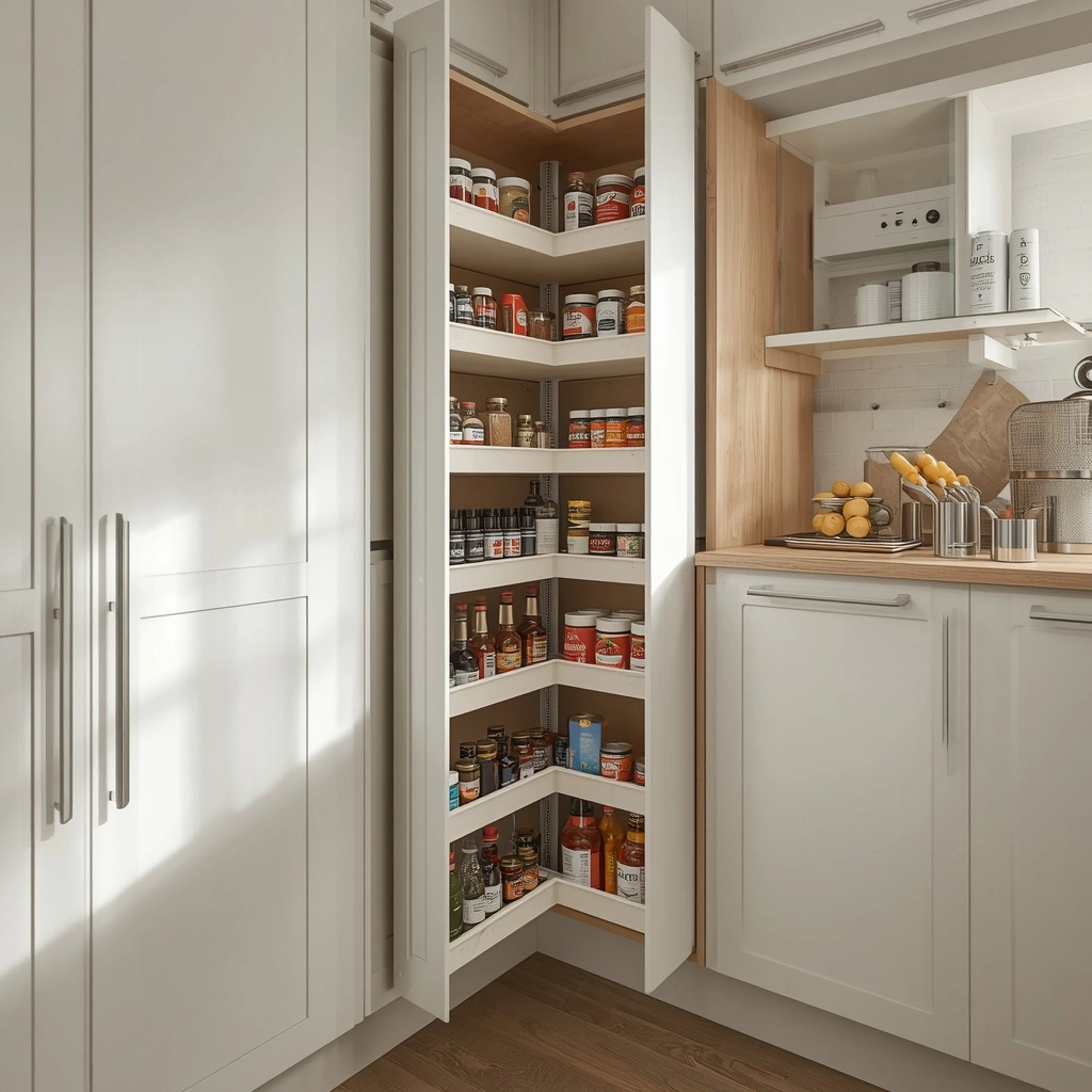
| Pull-out kitchen organiser | Deep cabinets you can never see into | Corner carousel, tall larder pull-out | Wire baskets for small jars |
| Under-stairs unit | The largest wasted volume in a small house | Hinged-step drawers, sliding shoe rack | Fixed shelves you cannot reach |
| Recessed wall niche | Storage taking zero floor space | Shower niche, bedside niche | Anything cut into a load-bearing wall without a structural check |
Closed fronts calm visual noise; a little open display keeps the room alive. All-closed reads as a cupboard, all-open reads as a shop.
Built-Ins Are Calmest — Tall, Shallow Units Are the Rental Version
Built-in storage fits wall to wall and removes the jagged gaps that freestanding pieces create. A shallow built-in around a door, bed, or media wall holds a surprising amount without stepping far into the room. Depth is the constraint to watch: 30–35 cm is enough for books, files, and folded clothes, and it costs far less floor than a standard 55 cm unit.
Renters can borrow the same idea with tall, shallow cabinets in one finish along one wall. Matching height and matching finish is what makes storage read as architecture instead of extra furniture — three different-height units in three different wood tones will always look like three purchases. Shallow is only an advantage if the interior still holds what you own, so check what to measure before you buy a living-room cabinet.
Interior Design for a Small Living Room: One Layout for Hosting, Working, and Unwinding
A small living room usually does three jobs: conversation, screen time, and weekday work. Arrange it around conversation first, because a layout that only faces a screen tends to strand seats and waste the center of the room.
Good interior design for a small living room keeps the walking path clear while giving each seat a reason to face another person. Settle three things before lamps and decor:
- Largest seat position and depth
- Rug big enough to connect the main seating
- Main path the route nobody should have to squeeze through
Everything else is negotiable. Those three are not.
Anchor Seats Around One Thing, Not Every Wall
Pushing every seat against the walls leaves a wide, awkward middle and pushes conversation too far apart. When depth allows, pull the sofa or chairs a little forward and let the rug connect the front legs, defining the sitting zone.
A larger rug makes compact living room design feel more generous than a small rug floating under a coffee table. The rule is simple: the rug should link the main seats. If only the front legs of the sofa reach it, the rug is too small.
Behind a floated sofa, a slim console can hold lamps or books and it gives the sofa a finished back instead of exposing upholstery to the room. Pull the seat roughly 60–120 cm off the wall first; if the sofa still hugs the wall, the console is decoration.
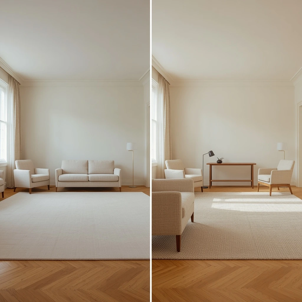
| Living-room situation | Layout that works | Layout that fights the room |
|---|---|---|
| Narrow room, door at one end | Sofa on the long wall, two light chairs opposite, rug connecting | Sofa plus two armchairs plus two side tables plus a console |
| Square room, one window | Sofa floated at 90° to the window, round table in the corner zone | Everything against walls, empty unusable center |
| Open plan with dining | Rug + console behind sofa as the boundary | Dining chairs facing the TV across an undefined gap |
| Room doubles as guest bedroom | Sofa bed as the anchor, storage ottoman as the only extra seat | A permanent second bed or an air mattress in a closet |
| Two people work from home | One fold-down desk plus one dining-table station | Two permanent desks in a room that also hosts |
A Round or Stretch-Out Table Keeps Dinner Flexible
A round dining table softens corners and lets people slide around the edge in tight dining spots. No one gets stuck at a corner leg, and a round top seats five where a rectangle seats four in the same footprint.
An extendable dining table gives weekday scale and guest capacity provided the leaves have a real storage place. If they do not, they end up behind a door where they block it, and the table stops extending.
I mount a television only when viewing distance and seat angle make sense, and I weigh it against a fireplace as the room’s focal point before either one wins the wall. A screen placed too high turns the main seat into an airport lounge, and neck strain is a daily tax. Below it, a low closed console hides remotes and cables far better than an open stand.
Small Bedroom Design: The Bed Decides Everything Else
Place the bed before you choose anything else for the room. In a small bedroom the bed takes the largest single footprint, so its position settles where the wardrobe can go, how much side clearance survives, and whether the door can still open fully.
I put the bed on the longest uninterrupted wall, keep at least 60 cm (24 in) of clearance on one side and both sides where the room allows it, and confirm the door swing does not clip the corner of the mattress. A bed pushed into a corner saves floor but costs the second person a way in at night.

| Bed placement | Works when | Fails when |
|---|---|---|
| Centered on the longest wall | Two people share the bed; both sides need access | The room is under ~2.7 m wide no clearance survives either side |
| Against a corner wall | Single sleeper, or the room is genuinely tight | Two people share it; one side becomes a climb |
| Under the window | The sill sits above headboard height | The window is the room’s only one, or the headboard blocks the opening |
| In an alcove | The alcove is wider than the mattress by 10 cm+ | You lose the recess as storage and gain a bed you cannot make |
| Foot facing the door | The room is deep and narrow | The door swing reaches the bed frame |
Wardrobe Depth Beats Wardrobe Width
Buy the wardrobe after the bed is settled, and buy it for depth first. A full-height wardrobe uses the dead volume above 180 cm that no other piece can reach, but it only works on a wall the door does not swing across.
Standard depth is 55–60 cm for hangers on a rail. If the floor cannot give that, a 35–40 cm unit with a pull-out rail or shallow drawers still holds folded clothes and files, and it gives back 20 cm of walking space — which in a 2.5 m-wide room is the difference between a path and a squeeze.
One thing I avoid: a tall dark wardrobe directly facing the foot of the bed. It reads as a wall moving closer. Same finish as the wall, or a mirrored front, keeps it quiet.
Under-Bed Storage Only Works If You Can Reach It
Under-bed storage is the largest reclaimable volume in a small bedroom, and the most often wasted. Drawers need roughly 60 cm of side clearance to open, so they fail in a bed pushed against a wall on both sides.
| Option | Reach | Best for | Watch out for |
|---|---|---|---|
| Platform drawers | Good, if side clearance exists | Linens, off-season clothing | The drawer front hits the nightstand |
| Ottoman / gas-lift base | Excellent — lifts from the foot | Beds with no side clearance at all | The mechanism is the first thing to fail; test it loaded |
| Rolling boxes on casters | Moderate — you pull them out | Low beds, rented rooms | Anything deeper than 20 cm becomes unreachable at the back |
| Vacuum bags, no container | Poor | Truly seasonal items only | They crease everything and leak air by month three |
Store seasonal and weekly items under the bed. Daily items stored there end up on a chair, because reaching them is a small excavation every morning.
Bedside: One Surface, Not Two Nightstands
A small bedroom rarely has room for two nightstands, and almost never needs them. One clear surface per sleeper is the target, and a wall-mounted option costs zero floor.
| Bedside option | Floor cost | Holds | Fails when |
|---|---|---|---|
| Wall-mounted shelf | Zero | Phone, a book, a glass | You keep a full glass of water and knock it |
| Narrow table, 30–40 cm | Low | One drawer + surface | It sits in the drawer-clearance path |
| Headboard with a built-in ledge | Zero | Phone, reading light, a book | The ledge is too shallow for a lamp base |
| Sconce + no surface at all | Zero | Light only | You have nowhere to put the phone |
Keep whatever surface you choose clear. A bedside table carrying a week of accumulated objects makes the room feel smaller than any furniture choice could.
Light and Color Where You Sleep
The bedroom palette should be the calm end of the whole-home scheme, not a new scheme of its own. Light works differently here than in a living room, because the room has to support sleep and getting dressed, usually within the same hour.
Three layers, adjusted for the room’s job:
- Ambient at 2700K on a dimmer, so the room can drop toward evening without a second switch
- Task at each side of the bed — a wall sconce or a small lamp aimed so one reader does not light the other’s pillow
- Dress light at the mirror or wardrobe, at 3000K or above, because 2700K flatters the room and lies about the outfit
Blackout or a sheer-plus-blackout pair solves early sun and west-facing glare in one move. Hang the rod at the same 15–20 cm above the frame used elsewhere in the home, so the ceiling height reads consistently from room to room.
The Entry, Kitchen, and Bath Need Systems, Not More Baskets
The front door tells the truth about a small home. Shoes collect, bags hit the floor, keys wander, and the first meter sets the tone for everything after it.
Kitchens and bathrooms fail the same way: daily items have reach, moisture, and timing problems that loose baskets cannot solve. A basket is a container. A system is a container in a defined place, sized for a defined habit.
Design by action: arrive, cook, clean, wash, get ready. Each action needs a landing place within reach.
Give Shoes, Keys, and Coats a Landing Strip
An entry needs shoe storage, hooks, a small surface, and a mirror in one tight run. I use a slim closed shoe cabinet to keep the path open, with ventilation for enclosed shoes and rounded corners in a narrow passage a sharp corner at hip height in a 90 cm hallway is a daily bruise.
Only the current season’s shoes stay at the door. The rest belongs with bedroom or seasonal storage. That single limit stops the entry from becoming a second closet with a welcome mat on top.
| Entry problem | Fix | Footprint cost |
|---|---|---|
| Shoes scattered | Slim closed cabinet, 20–25 cm deep, tilted shelves | Low |
| No key/bag landing spot | Hooks at two heights + a 20 cm shelf or narrow console | Near zero |
| Dark entrance | Wall sconce or a mirror opposite whatever light exists | Zero floor |
| Wet shoes in monsoon/rain | A washable tray at the door, shoes dried elsewhere | Zero floor |
| Coats on chairs | Hooks behind the door, or one shallow rail unit | Low |
Pull-Outs Rescue the Back Corners of a Small Kitchen
Deep base cabinets swallow pans and appliances. Pull-out racks, corner inserts, tray dividers, and one tall narrow unit bring the back of the cabinet into reach the difference between storage you use and storage you forget.
The organizing logic is weight and frequency:
- Heavy daily pans low, near the cooktop
- Spices and prep tools at elbow height, near the cutting surface
- Serving pieces and light items higher
- Rare appliances in the one place you would have to step for
Keep the counter clear. In a kitchen measured in single square meters, the counter is the workspace, and a workspace buried under appliances is a kitchen that cannot cook. Vertical storage a magnetic knife strip, a hanging rail, wall shelves for daily cups is how you buy that counter back.
A breakfast counter adds prep and eating space if the stools tuck fully beneath it. If they block the path, choose a fold-down counter or a small round table instead.

Separate the Splash Zone From the Getting-Ready Zone
A wet-and-dry bathroom layout keeps towels and grooming tools away from direct splash, wherever the room shape allows. Even in a 2 m² bathroom you can usually separate the two by turning the vanity 90° or moving the towel rail to the far wall.
I use a floating vanity or slim cabinet to show more floor visible floor is what makes a tiny bathroom read as larger and a mirror cabinet for small daily items, which removes the need for a shelf that would crowd the shower.
| Bathroom constraint | What fits | What to avoid |
|---|---|---|
| Under 2 m² | Corner sink, wall-hung WC, recessed shower niche | A pedestal sink (wastes the volume beneath it) |
| No storage wall | Mirror cabinet + over-toilet shelf + over-door rack | A tall floor cabinet that blocks the door swing |
| Shared by several people | One shallow drawer unit per person, labeled zones | A single communal cupboard everyone digs through |
| Poor ventilation | Moisture-resistant finishes, closed fronts, no open wood near the shower | Fabric baskets, open shelving with towels beside splash |
| Rented | Tiered rolling cart, tension shelf, adhesive hooks | Anything drilled into tile |
Tiered carts suit renters because they roll out for cleaning. Daily products stay visible; back stock stays closed and dry. A cart holding every bottle you own is not storage it is clutter on wheels.
That Awkward Corner Might Be the Most Useful Spot You Own
Corners look harmless until a door hits a cabinet, or a dead triangle starts collecting bags. Give every odd corner one job reading, charging, a slim shelf, or low-use storage and it stops being a magnet.
A corner fails when it becomes the place for everything, precisely because it has no plan. Door swing space deserves equal respect: a bookcase can fit behind a door on paper and still annoy someone ten times a day.
Stop Losing Floor to a Swinging Door
Sliding, pocket, and bi-fold doors free the arc a hinged door needs in bathrooms, closets, and tight halls. That arc is often half a square meter of floor that no furniture can ever use.
| Door type | Floor it saves | Trade-off | Best for |
|---|---|---|---|
| Hinged (standard) | None needs the full swing arc | Cheapest, best acoustic and privacy seal | Rooms with space to spare |
| Sliding (surface-mounted) | The whole arc | Poorer sound seal; needs clear wall beside the opening | Bathrooms, closets |
| Pocket (into the wall) | The whole arc, plus the wall beside it | Requires wall rebuild; hard to retrofit; plumbing/electrics in the wall are a problem | Owner projects, tight halls |
| Bi-fold | Most of the arc | More moving parts to maintain; narrower opening when open | Wardrobes, utility cupboards |
| Curtain or open shelf as a boundary | The whole arc, and it is removable | No privacy, no sound control | Renters, zoning within one room |
Check privacy, hardware quality, wall structure, and access before calling any swap simple. Fluted or frosted glass can share light between rooms in owner projects when privacy and cost both allow it.
Turn the Bright Edge by the Window Into a Seat or Shelf
A window seat can hold reading, guest seating, and closed storage in one footprint. A low bench or narrow bookcase under the sill borrows the same idea without built work.
Leave enough glass clear for daylight and ventilation a seat that covers the lower half of the only window trades light for storage at a bad exchange rate.
A reading nook needs three things: a comfortable seat, a small surface within reach, and light near shoulder height. Place it clear of passing knees, or it becomes a seat nobody sits in.
Stairs, Platforms, and Odd Angles Need a Lighter Touch
Under-stairs storage suits shoes, cleaning gear, luggage, or a compact desk when headroom allows. Drawers often beat a deep cupboard here, because drawers bring the contents forward to you instead of asking you to reach into the dark.
Anything beyond that moves into professional territory fast. Raised platform storage, mezzanines, structural steps, wiring, and guard rails all involve load, egress, and electrical safety. I leave that work to qualified local professionals. Clever is not clever if access feels unsafe.
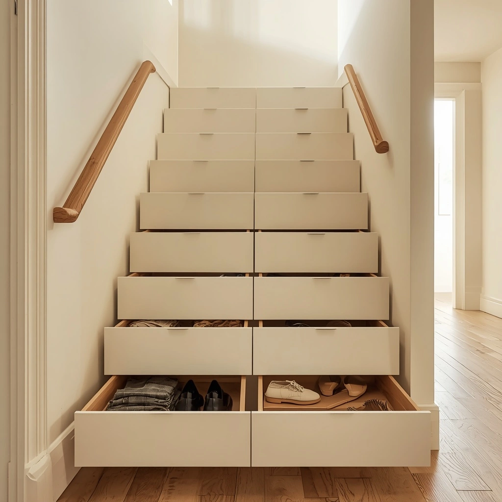
| Under-stairs option | Works when | Fails when |
|---|---|---|
| Hinged-step drawers | The stairs are being rebuilt anyway | Existing closed risers cannot be cut |
| Pull-out shoe rack | Headroom at the tall end exceeds ~150 cm | The whole run is under 120 cm |
| Compact desk | One end has standing headroom and a power source | You would have to sit under a low soffit |
| Closed cupboard | You need to hide cleaning gear or luggage | The contents are needed daily — reach is too far |
| Left open with one shelf | Budget is minimal | It becomes the house’s default dumping ground |
Modern Interior Design for Small Homes Can Feel Warm, Not Bare
Modern does not have to look like an empty gallery. Modern interior design for small homes feels current when fewer objects meet warmer surfaces: wood, fabric, matte metal, and one or two tactile contrasts.
Minimalist interior design fails when every object gets banished and the room loses comfort. Keep the editing discipline, and add softness back on purpose.
Warm Woods and Soft Texture Stop Minimal From Feeling Empty
Texture does the talking in a restrained palette. A Japandi-leaning mix Japanese restraint with Scandinavian warmth suits compact rooms for exactly this reason, and the full list of interior design styles shows where that blend sits against the alternatives. Linen, light oak, a wool throw, a bouclé cushion, or a travertine-style table adds depth without visual noise.
Repeat one wood tone and one metal finish across connected rooms. Repetition gives visual continuity, so the eye moves through the home instead of stopping at every doorway to decode a new theme. Three wood tones in an open plan reads as three rooms that never agreed on anything.
| Element | Adds warmth | Turns the room cold |
|---|---|---|
| Wood | One warm tone repeated: floor, shelf, table leg | Four different tones, including a glossy orange one |
| Metal | One finish repeated: handles, lamp base, table frame | Mixed chrome, brass, and black on adjacent pieces |
| Textile | Linen, wool, bouclé, cotton matte surfaces | Everything smooth, glossy, or synthetic-feeling |
| Objects | Three things you actually use or love | Twelve small ornaments on every flat surface |
| Green | One or two real plants with room to grow | Six dying pots on a windowsill that gets no light |
Borrow the Rules Tiny House Interior Design Lives By
Tiny house design teaches intention under pressure. Every object needs a use, a home, or a reason strong enough to survive the edit. Fold-away work surfaces, fitted storage, dual-purpose seating, and a clear nightly reset all transfer well to a small apartment or a modest family house.
One caution: tiny house interior design usually means 10–40 m² (roughly 100–400 sq ft), often on wheels or as a secondary unit, with lofts and composting systems. A small family house is a different problem with different constraints. Borrow the discipline, not the hardship a regular small home still needs a comfortable chair, meaningful art, and one empty surface for a cup.
Home Design for Small Spaces: Do These Fixes in Order
Buying order matters more than buying well. A beautiful cabinet can lock a weak layout in place for years, and most regret in small-home projects is about sequence rather than taste.
Test home interior design for small homes physically before permanent money is spent: move through the room, sit in every seat, open every drawer, and work there for an hour.
Five Traps That Keep a Small Home Feeling Crowded
| Trap | How it shows up | First fix |
|---|---|---|
| Too many pieces | Every gap has something in it; the floor is unreadable | Remove three items and live with it for a week |
| Wrong scale | Everything oversized, or everything miniature and nervous | Re-measure one anchor piece for depth, not just width |
| Blocked daylight | Curtains across glass, furniture in front of the window | Raise the rod, widen it, move the piece 60 cm |
| Every seat on a wall | A wide useless middle, conversation too far apart | Float the sofa, connect it with a rug |
| Storage before routine | Baskets and bins everywhere, clutter still on surfaces | Edit first; place storage against the daily/weekly/seasonal tier |
Check those five before blaming square footage. One honest look usually finds the first fix.
Rearrange First, Add Second, Build Last
Rearrange first. Edit, float the sofa, clear the window, move storage to the point of use, and live with the new layout for a full week including a day with guests and a day you work from home.
Add second. A right-sized rug, a well-placed mirror, a fold-down desk, or shallow storage for one named problem. These are portable, so a mistake costs you a return, not a renovation.
Build last. Pocket doors, fitted cabinets, platform storage, and custom benches belong after routines have proved the plan. Good home interior design for small homes grows calmer at each stage, because every purchase has to pass a daily-use test rather than a showroom test.
What It Costs, and Where to Spend It
Spend in this order: free moves, then paint and light, then textiles, then storage, then furniture, then built work last. Most of what makes a small house feel larger costs less than one piece of furniture.
| Stage | What you do | Cost band | Time | Reversible? |
|---|---|---|---|---|
| 1. Edit | Remove everything not used weekly; store seasonal items elsewhere | Free | One weekend | Yes |
| 2. Rearrange | Float the sofa, clear the window, open the center, re-measure footprints | Free | One day | Yes |
| 3. Paint | Walls, trim, and ceiling in one related scheme; trim matched to wall | Low | One weekend | Mostly |
| 4. Light | Add task + accent layers, move to 2700K–3000K, fit a dimmer | Low–Medium | One week | Yes |
| 5. Textiles | Curtains hung high and wide, one properly sized rug, cushion swap | Low–Medium | One week | Yes |
| 6. Mirrors + hardware | Mirror opposite the window; new handles and switch plates | Low | A few days | Yes |
| 7. Portable storage | Tall shallow cabinets, over-door racks, under-bed boxes, carts | Medium | Two weeks | Yes |
| 8. Furniture | One honest-sized anchor, multifunctional pieces, right-sized table | Medium–High | Phased | Partly |
| 9. Built work | Pocket doors, fitted cabinets, under-stairs units, window seat | High | Weeks | No |
Worth spending more on: the mattress, the anchor sofa’s mechanism, kitchen pull-out hardware, and anything structural. These fail visibly and expensively.
Worth saving on: decorative accessories, side tables, open shelving brackets, rugs in low-traffic rooms, and lighting shades the bulb matters more than the fitting.
Localize this before publishing. Costs vary enormously by city and country. If your readers are in Pakistan, replace the cost bands with PKR ranges you have verified locally, and name real sourcing options (for example: LED bulbs and light fixtures from Daraz or a local electrical market, fabric and curtains from a local textile market, cushion covers from Khaadi Home or Ideas by Gul Ahmed, planters from a Sunday bazaar). Verified local prices are a genuine ranking advantage very few pages serving this query do it. Re-check figures before each update, because stale prices destroy trust faster than missing ones.
FAQs
What colors make a small room look bigger?
Colors that keep connected surfaces calm make a small room look bigger. Pale warm tones reflect light, and a cohesive deep tone can soften edges instead of chopping them. The bigger factor is contrast: sharp breaks between walls, trim, ceiling, floor, and large furniture divide the room into smaller pieces. Match trim to wall color and keep the ceiling at or lighter than the walls.
Should I buy smaller furniture for a small room?
Not automatically. Furniture should match the room’s proportions and paths rather than shrinking by default. A crowd of small pieces fragments sight lines and makes a room look nervous. Measure depth, height, leg clearance, and walking space, then choose fewer pieces that do real work one full-length sofa with slim arms and a low back often beats a loveseat plus two chairs.
How much floor should stay open in a small living room?
Aim to keep roughly 60 to 65 percent of the floor visually open as a starting check. That is a planning heuristic, not a building standard. Doors, narrow proportions, and household size all shift the balance, so walk the main routes with your hands full before locking the layout. If movement feels tight, fix the arrangement before buying anything decorative.
Do mirrors really make a small room look bigger?
Yes, but only when placed well. A mirror enlarges a small room when it reflects daylight, a window, or a calm focal point. Placement matters more than size: a medium mirror opposite the main window usually beats a large mirror facing a cluttered shelf. Center it around 145–150 cm (57–59 in) from the floor, and check the reflection from the doorway before drilling.
How can I add storage without making my small home feel cramped?
Keep storage shallow, closed, vertical, and close to the task. Edit first new containers only hide objects that no longer serve a routine. Then place daily items within arm’s reach, weekly items behind doors, and seasonal items under beds or inside benches and ottomans. Tall shallow cabinets in one finish along one wall read as architecture rather than extra furniture.
Can I work from home in a small living room without a permanent desk?
Yes. A fold-down desk, a wall-mounted surface, or the dining table with one reset box can all support regular work in a small living room. The setup needs daylight, an outlet, a chair plan that does not block circulation, and hidden cable storage. Keep the reset under ninety seconds, or the fold-away desk becomes a permanent shelf within a week.
Are built-ins worth it, or should I use freestanding storage?
Built-ins suit stable layouts and awkward walls, because fitted storage removes the wasted gaps freestanding pieces leave. Keep them shallow 30–35 cm handles books, files, and folded clothes. Freestanding storage suits renters and changing households, provided the units stay tall, shallow, and visually consistent in one finish and one height.
What is the cheapest way to make a small house feel bigger?
Rearrange and edit, both of which cost nothing. After that, the cheapest high-impact moves are paint (matching trim to walls, ceiling at or lighter than the walls), raising the curtain rod 15–20 cm above the frame, adding a second and third light layer at warm 2700K, and one mirror opposite the main window. Those four changes together usually do more than any single furniture purchase.

Pingback: DIY Room Decor for Small Apartments: 10 Space-Saving Ideas
Pingback: Neutral Color Palette Interior Design: 7 Simple Room Combos
Pingback: Guest Room Decorating Ideas: 20 That Actually Work - sfdecorstyle.comGuest Room Decorating Ideas: 15 Simple Touches Guests Love
Pingback: What Is Traditional Interior Design? A Clear Guide
Pingback: Best Materials for Industrial House Interiors: 12 Picks
Pingback: Yellow Bedroom Ideas: 9 Easy Looks That Feel Calm and Warm